Eye-catcher.
In the jungle of up-and-coming CBD suppliers, attention is everything. A striking packaging design becomes a decisive competitive advantage. limewood focuses on conciseness: with catchy product names, sophisticated packaging and bright designs.

Product names with a system
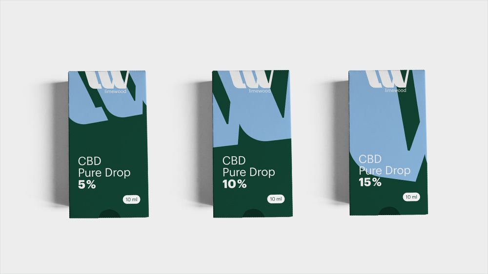
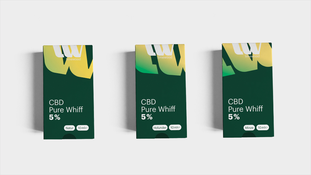
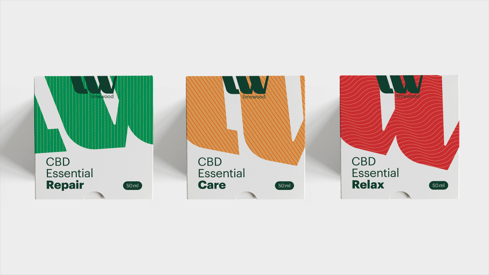
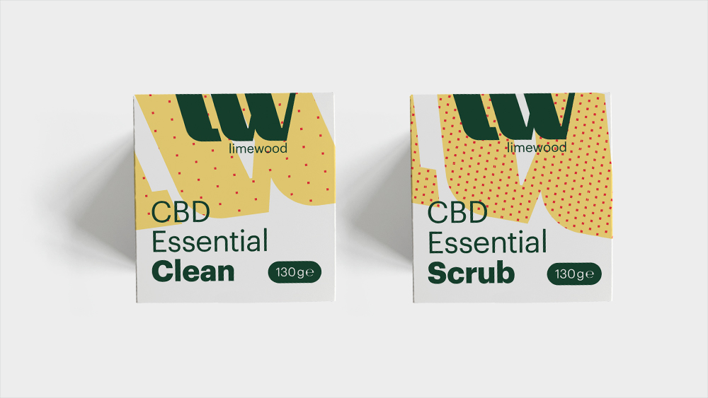
The limewood range comprised eleven products at the start. A well-thought-out naming structure was needed that met several requirements: Clarity and uniformity on the one hand, but also independence and conciseness in comparison to similar products from competitors on the other. It was particularly important to develop a future-proof system. This means that the product range can easily be expanded, extended and supplemented in the coming years.

Distinctive design
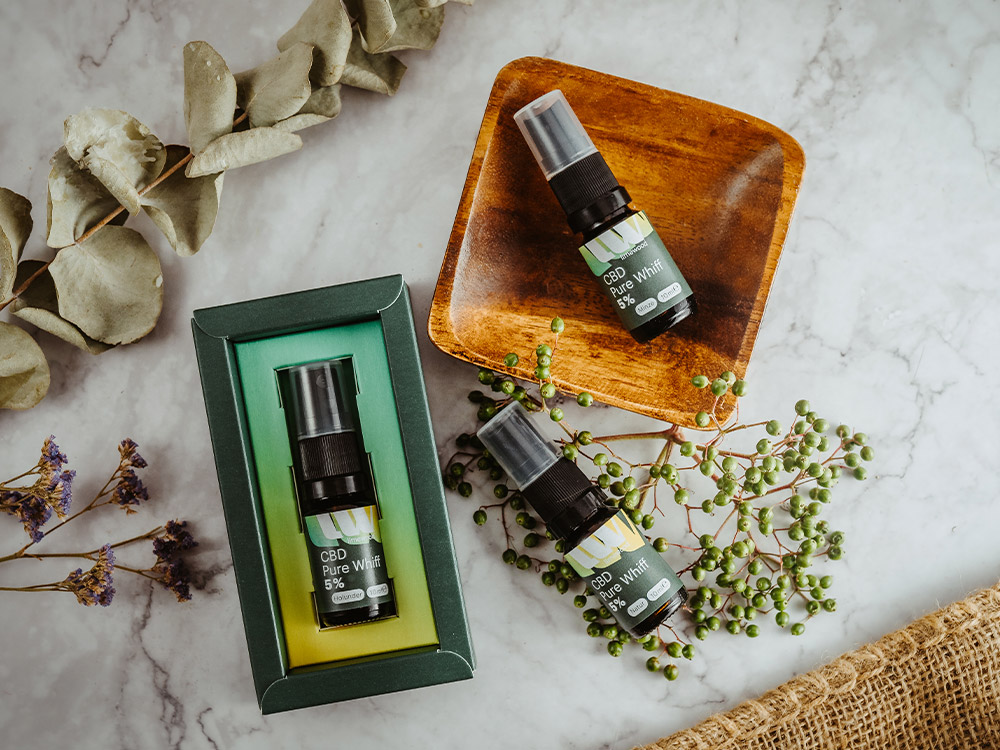
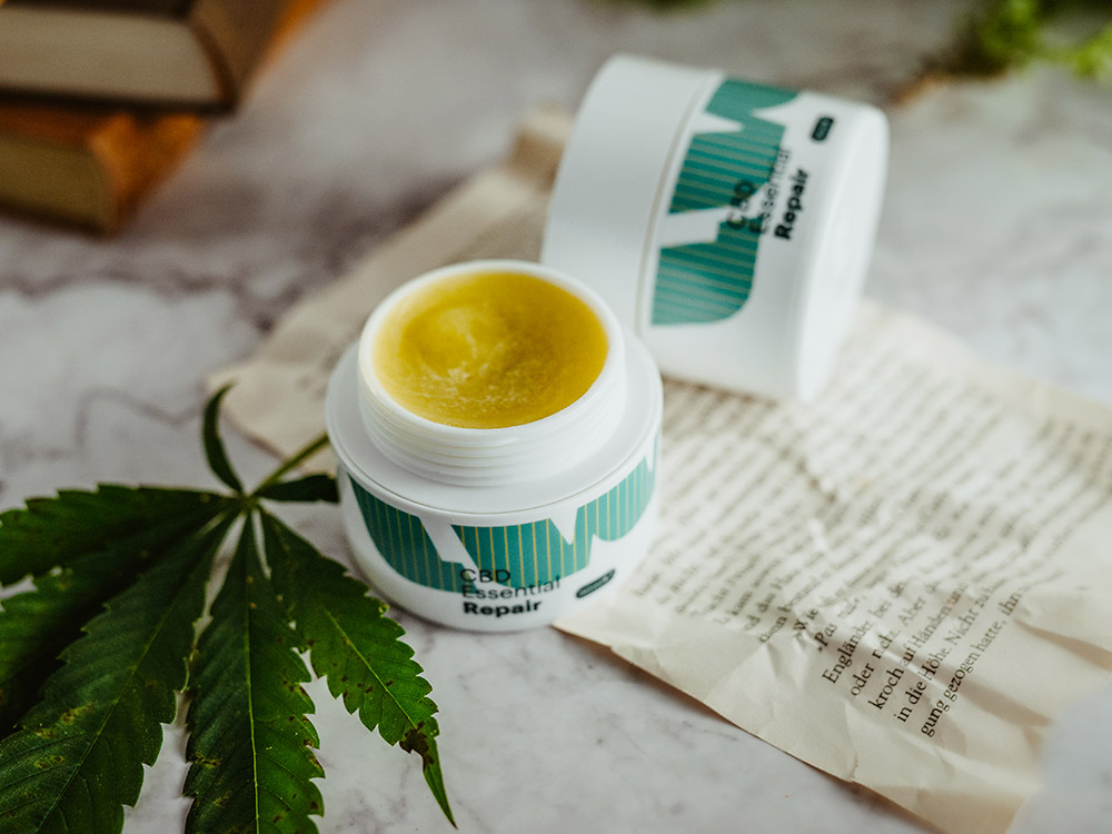
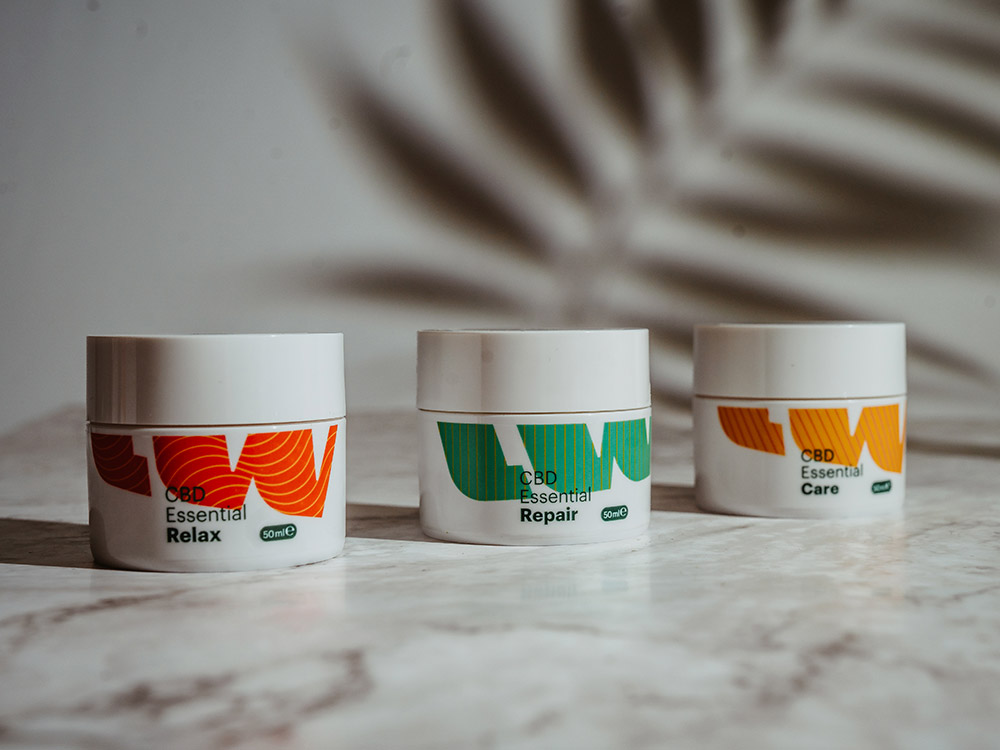
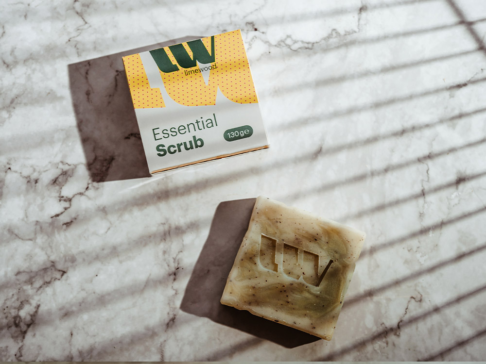
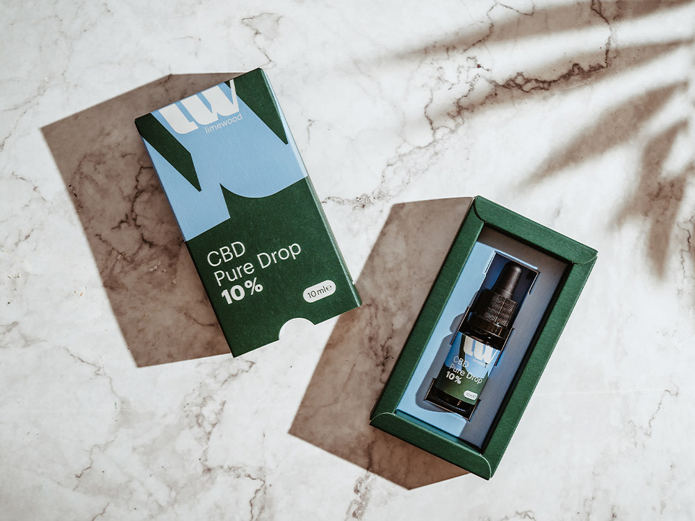
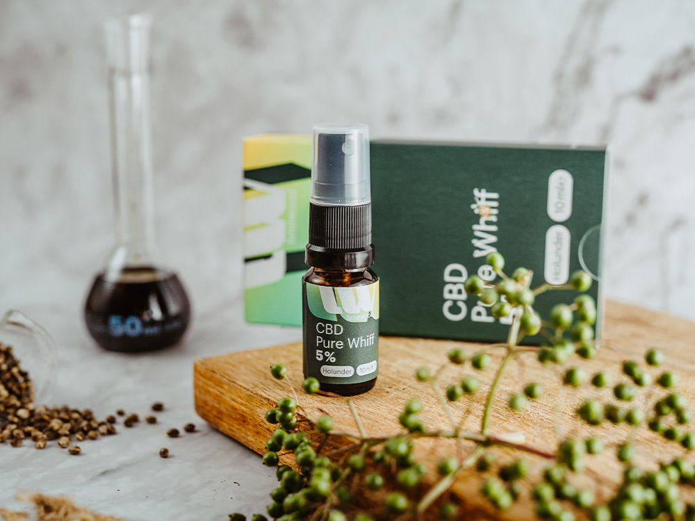
The young brand currently covers three major product areas with its range: CBD oils and CBD sprays in various intensities as well as cosmetics and care products with CBD. As with the naming, the packaging design also required a look that conveys a stringent brand image but still ensures that the individual products can be quickly distinguished. Clearly defined color codes and the targeted use of color gradients and patterns make it easier for consumers to find their way around the store.

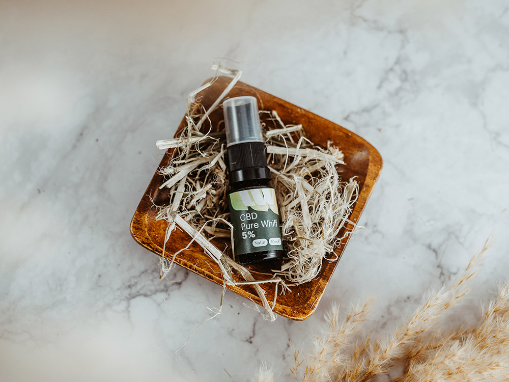
Product photography
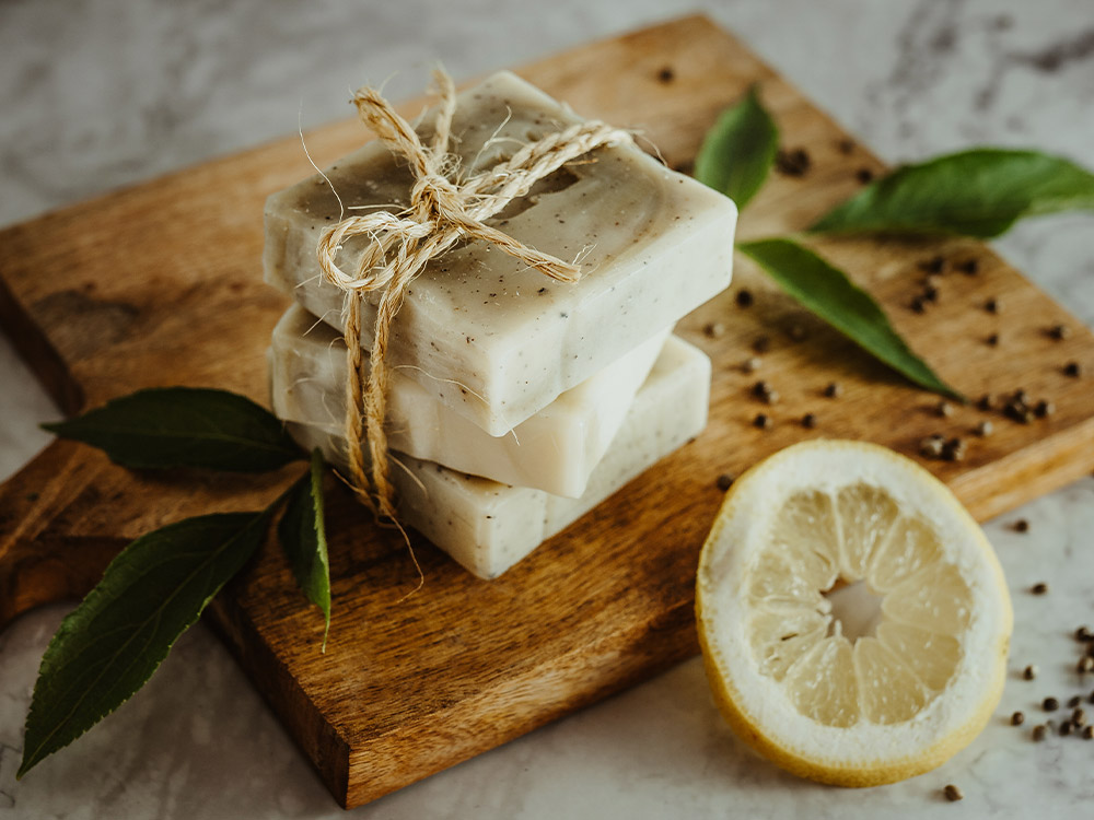
Natural, stylish and clean: the product photography consistently continues the unmistakable character of the brand. High-quality images convey the brand’s high quality standards, reportage-style shots incorporate the natural ingredients and the focus on details brings the products very close to people. The images perfectly round off limewood’s successful brand image.