A class of its own.
CBD products are only available in health food stores – dusty and uncool? Not with limewood. The brand is self-confident and breaks with common clichés: regionality meets a cosmopolitan appearance, sustainability meets cool style.

Logo
High-quality, confident, in tune with the times: the limewood logo makes a clear statement. The expressive figurative mark consisting of the capital letters L and W is complemented by the company’s finely elegant lettering. These two components make the logo flexible for a wide variety of applications – whether in a vertical or horizontal design. In addition, the figurative mark itself can become a self-confident design element that gives the packaging its unmistakable look, for example.

Design elements
The start-up demonstrates the courage to create a cool style: the font Graphik in the regular and bold styles ensure casual understatement. The primary color dark green is complemented by bright secondary colors that leave plenty of room for exciting compositions. The free use of the individual elements creates a fresh and unconventional brand image.

Image World
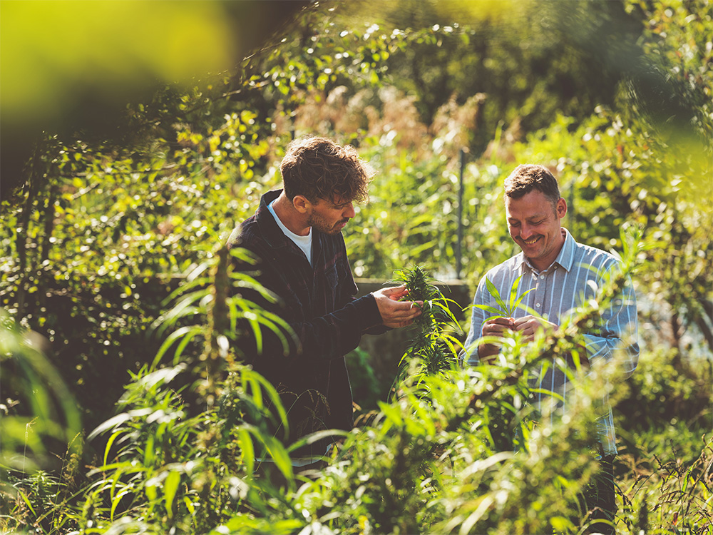
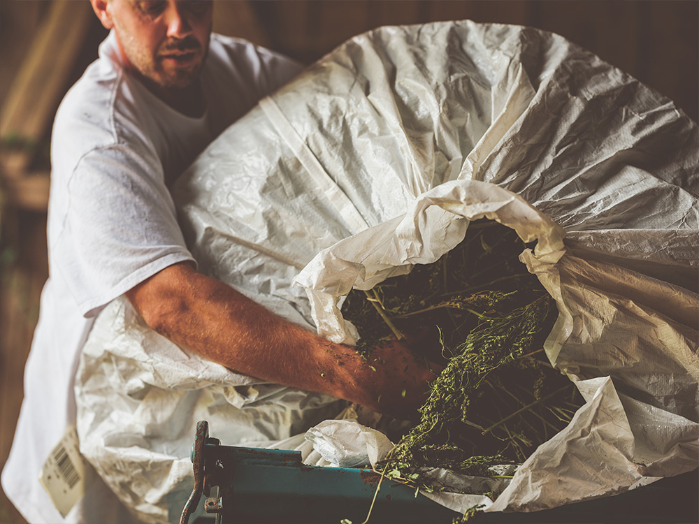
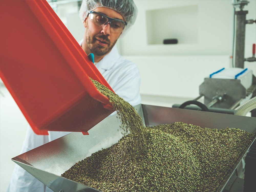
There’s nothing artificial here: limewood relies on an authentic visual world that gives people a look behind the scenes. Where do the plants grow, how are they processed, who is behind the brand? All these questions are answered by natural reportage photography – without filters, without effects, without heavy post-processing. This emphasizes the credibility of the brand and makes limewood approachable.


Implementation
The corporate design is in place, but the brand identity can only develop its full power once it has been implemented. That’s why the new look was rolled out straight away: consistently across all media channels and touchpoints, from the website and Instagram account to the stationery. Particular attention was paid to the design of the packaging, which had to impress at first glance.
New, bold, different: this is also what the business stationery conveys. The stationery is a real eye-catcher thanks to the colors, and the business cards are memorable thanks to their unusual format.


The webshop is limewood’s number one sales channel. The new imagery in particular is given generous space here. SEO-optimized texts also provide extensive information about the company and its products. We created the right look – the webshop was implemented by the digital agency rankeffect.