Design language from another world.
In April 2019, seven partners from the scientific, economic and social communities founded the Artificial Intelligence Network Ingolstadt, or AININ for short. As one of the largest application centres for artificial intelligence in Bavaria it pursues the goal of researching AI technologies and enabling their utilisation. With a brand design that literally speaks AININ’s language, we gave the partners a common voice for their external communications.
About AININ
AININ’s home is Ingolstadt’s technical university, THI. Here, the non-profit organisation consolidates its research findings in the areas of artificial intelligence and machine learning to “convert them into socially relevant products or production methods and subsequently also into the formation of new businesses”. In addition to economic applications, AININ also conducts foundational research to examine the social impact and application possibilities of AI technology.
Logo structure
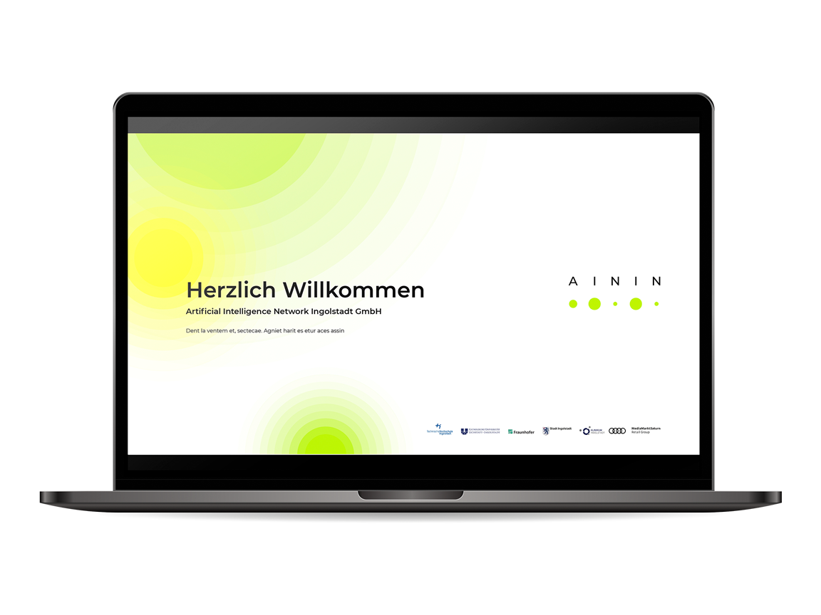
The logo consists of the word mark AININ and, below it, five dots in different sizes that “translate” the name into a fictional machine language. This results in a futuristic overall impression that effectively conveys AININs brand identity.
Design elements
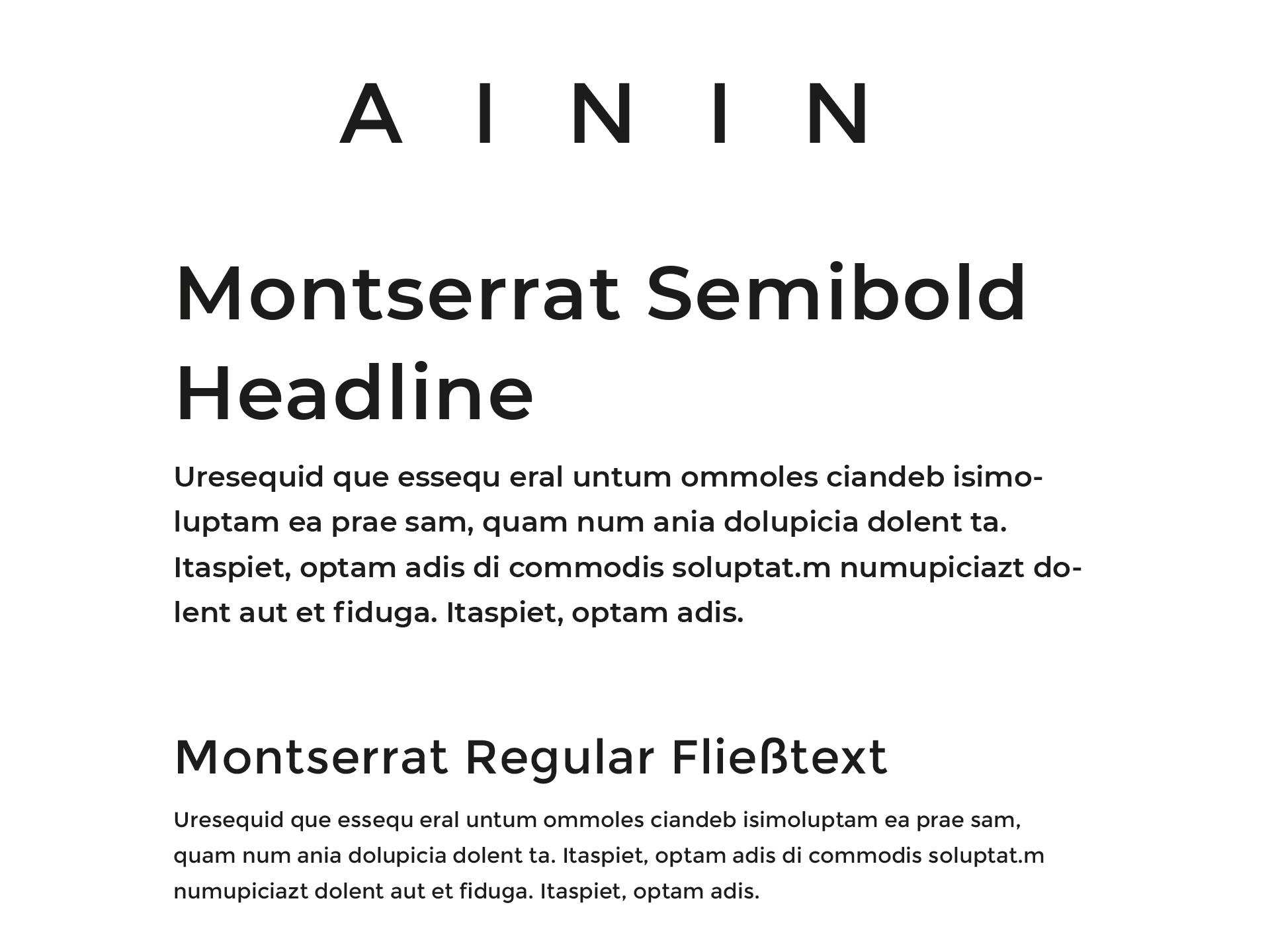
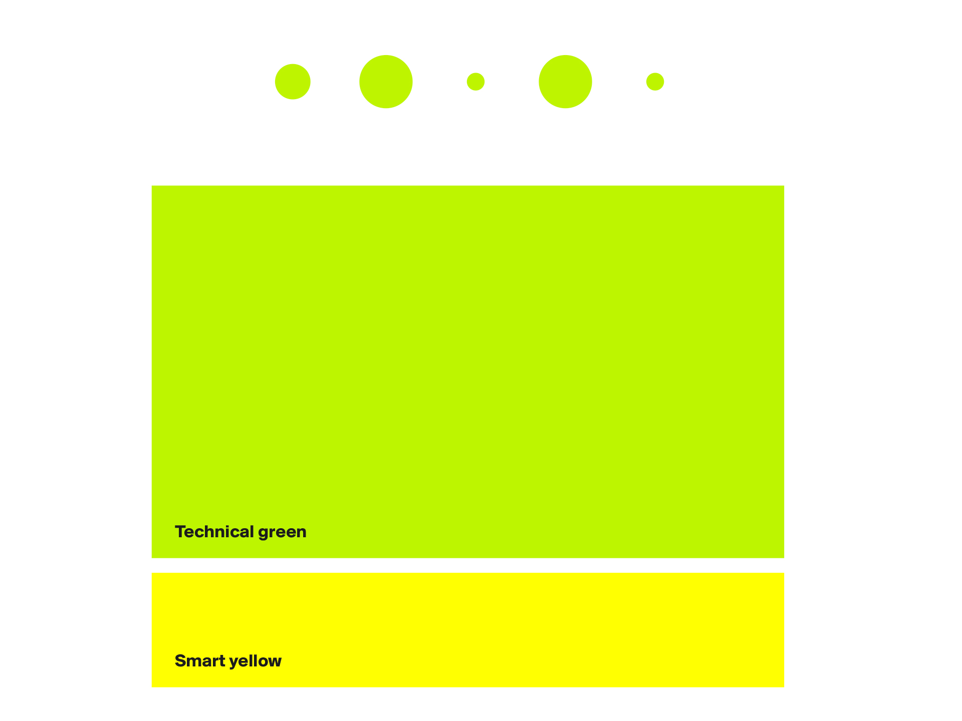
The brand design is based on a neon green colour evocative of glowing LEDs. In the logo’s case, this impression is reinforced in selected places by means of animating the dots in the manner of pulsating lights. The modern font Montserrat, generous white spaces and individually designed icons complete the characterful brand presence.