Hot spot for creative people worldwirde.
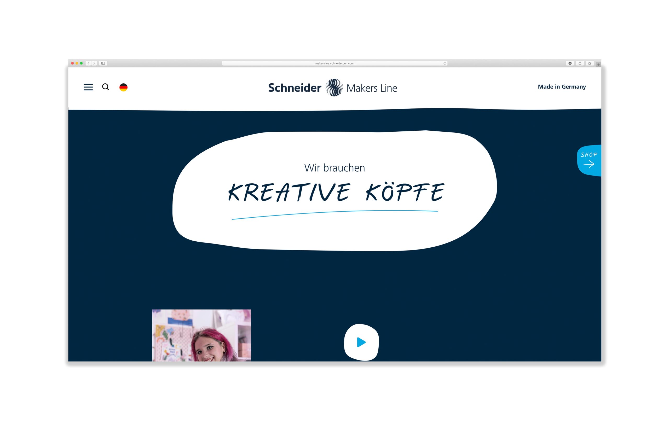
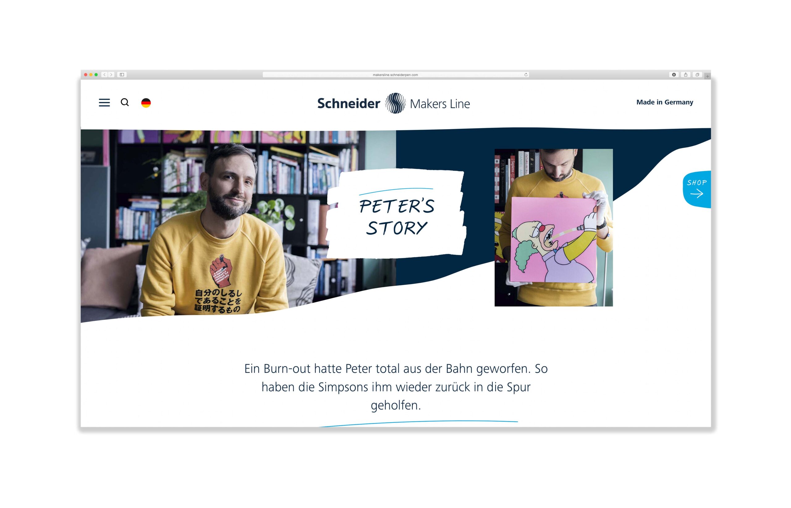
The Makers Line target group consists of digital natives – so a distinctive website is a must. We designed the central contact point on the web that provides important information, exciting backgrounds and interesting stories.
The look: unconventional & individual
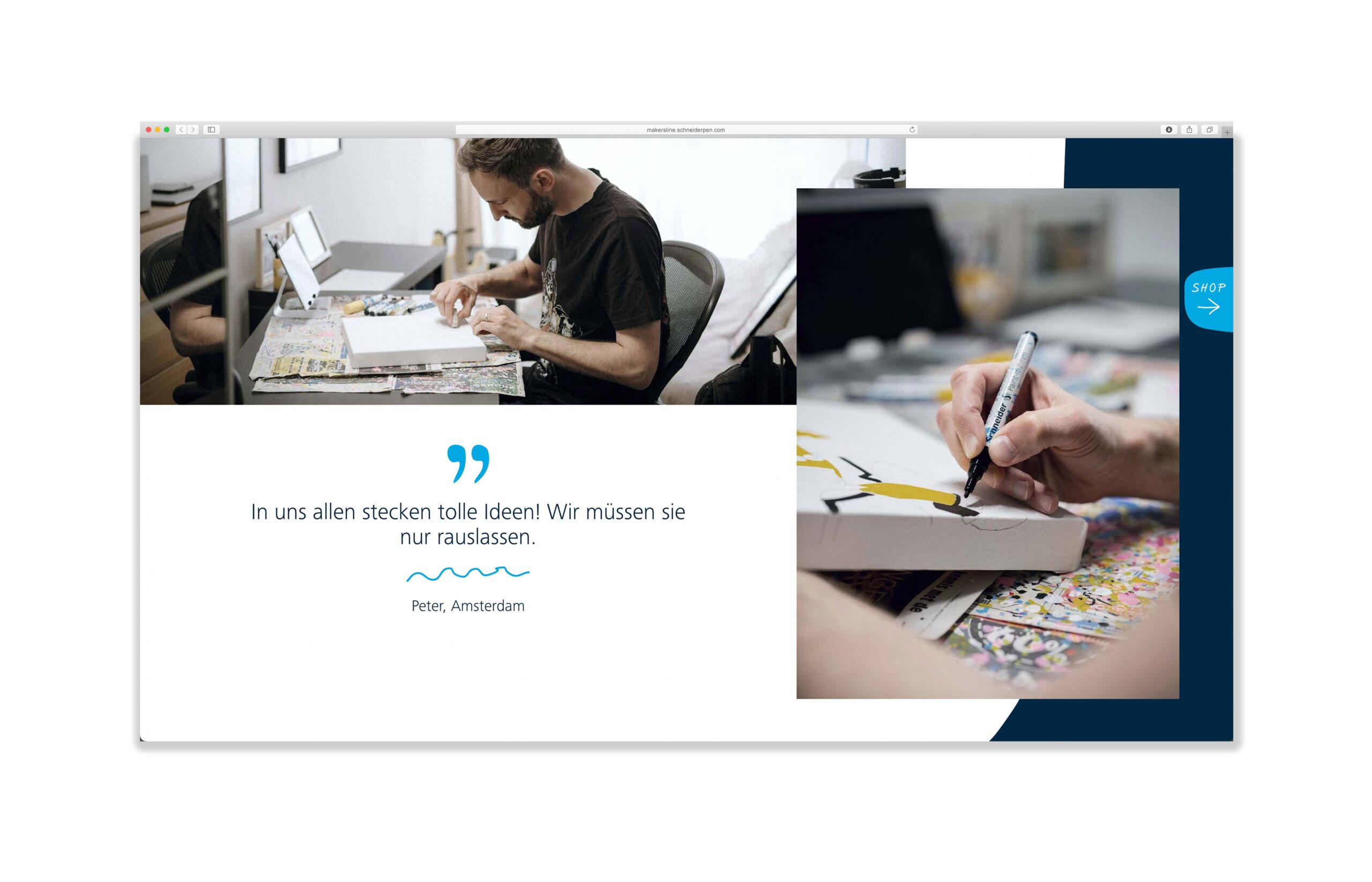
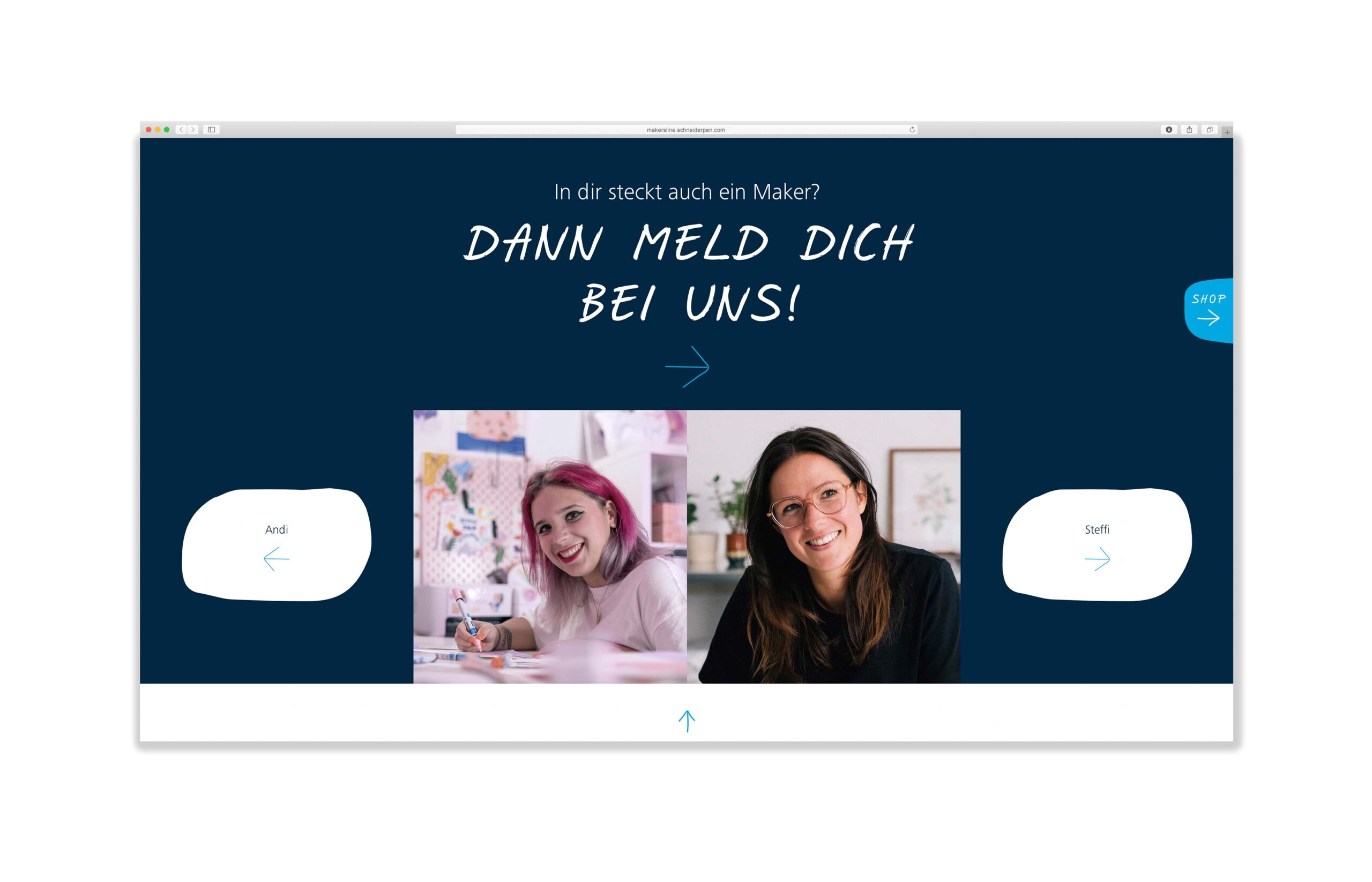
Handwritten-looking typography, highlights drawn with a marker, backgrounds that appear painted: Individuality is part of the DNA of Makers Line. This is also embodied in the design of the website – from discreet scribble elements to the shape of the buttons.
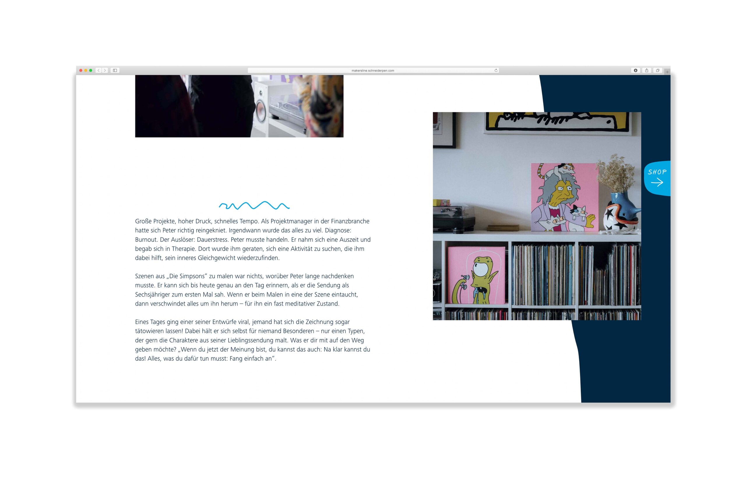
The products: clear & informative
Each product of the Schneider Makers Line is presented on its own page – including important information regarding color palette, line widths, use & Co. However, not only special features are highlighted: There are also videos for selected products that encourage and inspire users to get creative themselves.


The application: stylish & vivid
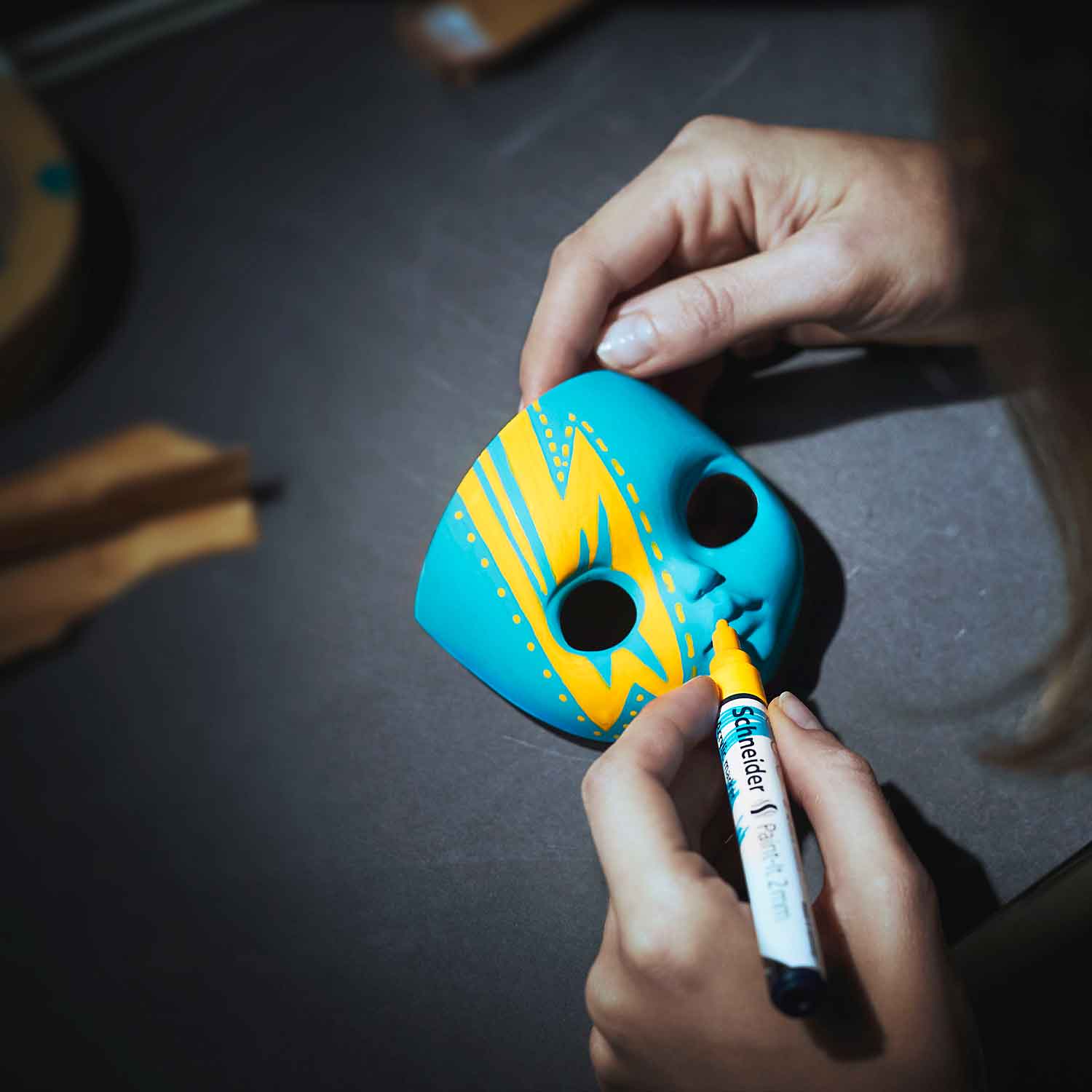
Acrylic spray, twinmarker or metallic rollerball: What can the individual tools in the Makers Line actually be used for? This is conveyed by the application images, which show concrete creative projects – in a striking, unmistakable visual language. In this way, the countless possibilities opened up by the Makers Line are conveyed in a brand-strong way.




The effects: individual & moving
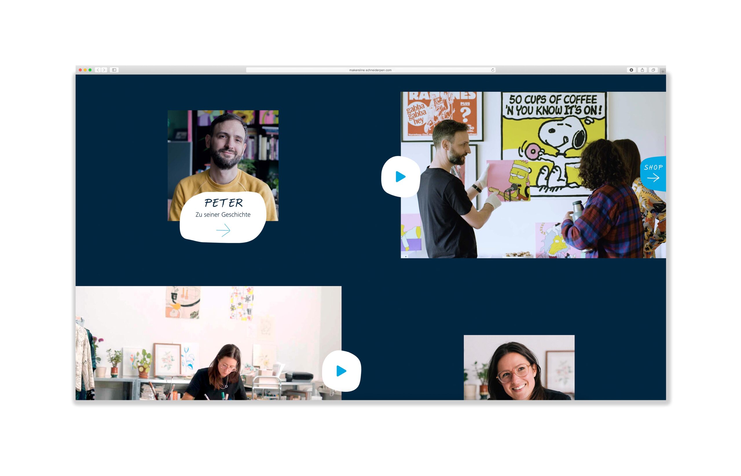
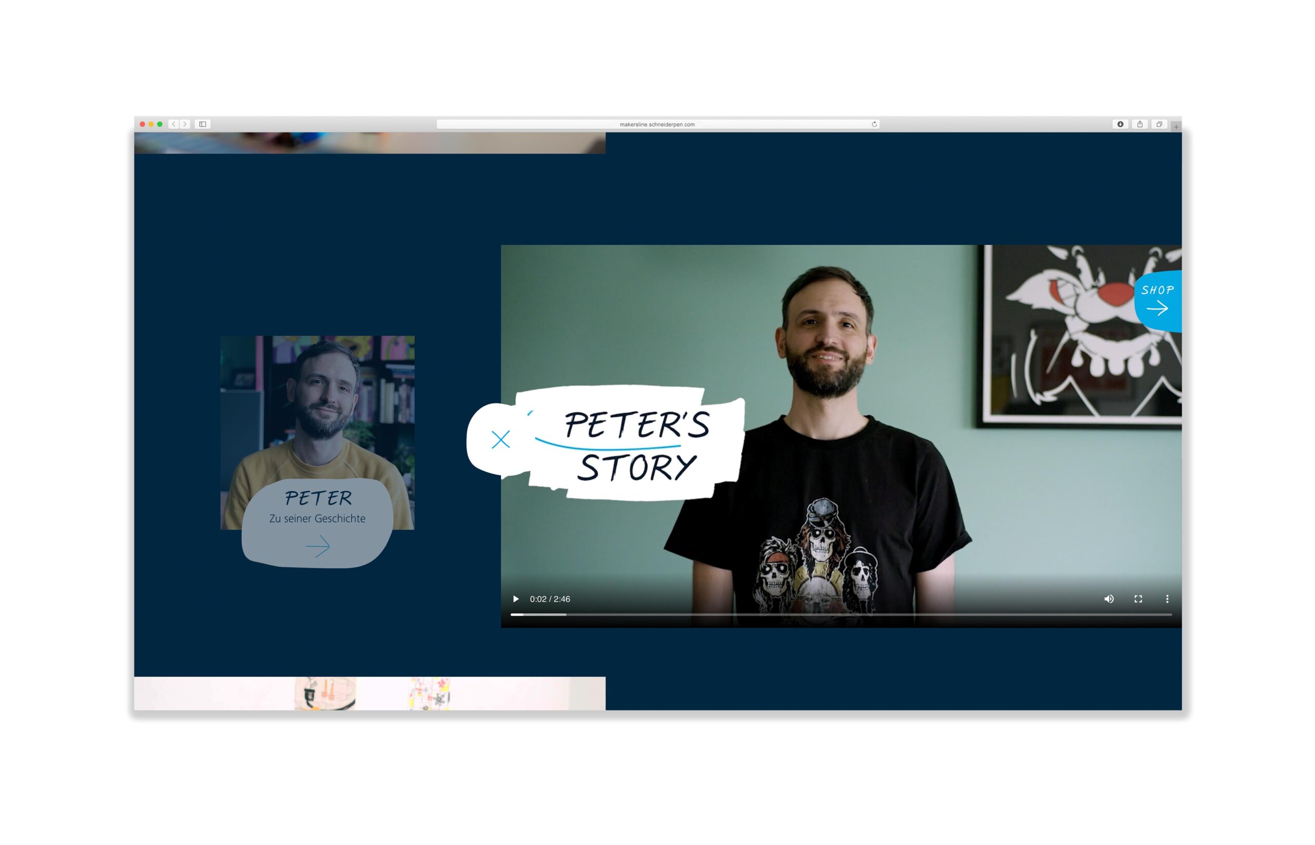
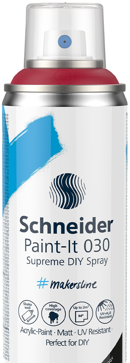
The individual products are often placed directly on the application images. This ensures a clean and casual look. Straight edges are absent here: The free, organic shapes and the individually designed scribble elements also continue in animated details such as arrows or buttons.
The user experience: surprising & unique
The online presence is as wild and untamed as the Makers Line itself: The menu flows down a color wall, the image gallery invites you to scroll through and discover. These special highlights turn a visit to the website into a unique brand experience.
The use: intuitive & optimized
The menu navigation is lean, the texts short and the design optimized for all devices: Regardless of whether users visit the website via computer, tablet or smartphone, the website always offers an optimal user experience.


