A broad grin on all channels.
Instagram, Facebook, TikTok & Co.: SocialHub’s heart beats digitally. That’s why the revised brand design was mainly rolled out as part of digital applications – from the brand paper in PDF form to the completely new website.
Brand Paper
A lot has changed in the revision of SocialHub’s corporate design: new logo, new font, new colours, new design elements. To help everyone keep an overview, a brand paper was created that bundles all design parameters into one document: compact, clear and digital as a PDF. On the one hand, this helps all employees with the transformation of the brand identity, and on the other hand, it also facilitates the work of external service providers, e.g. in the production of advertising material.


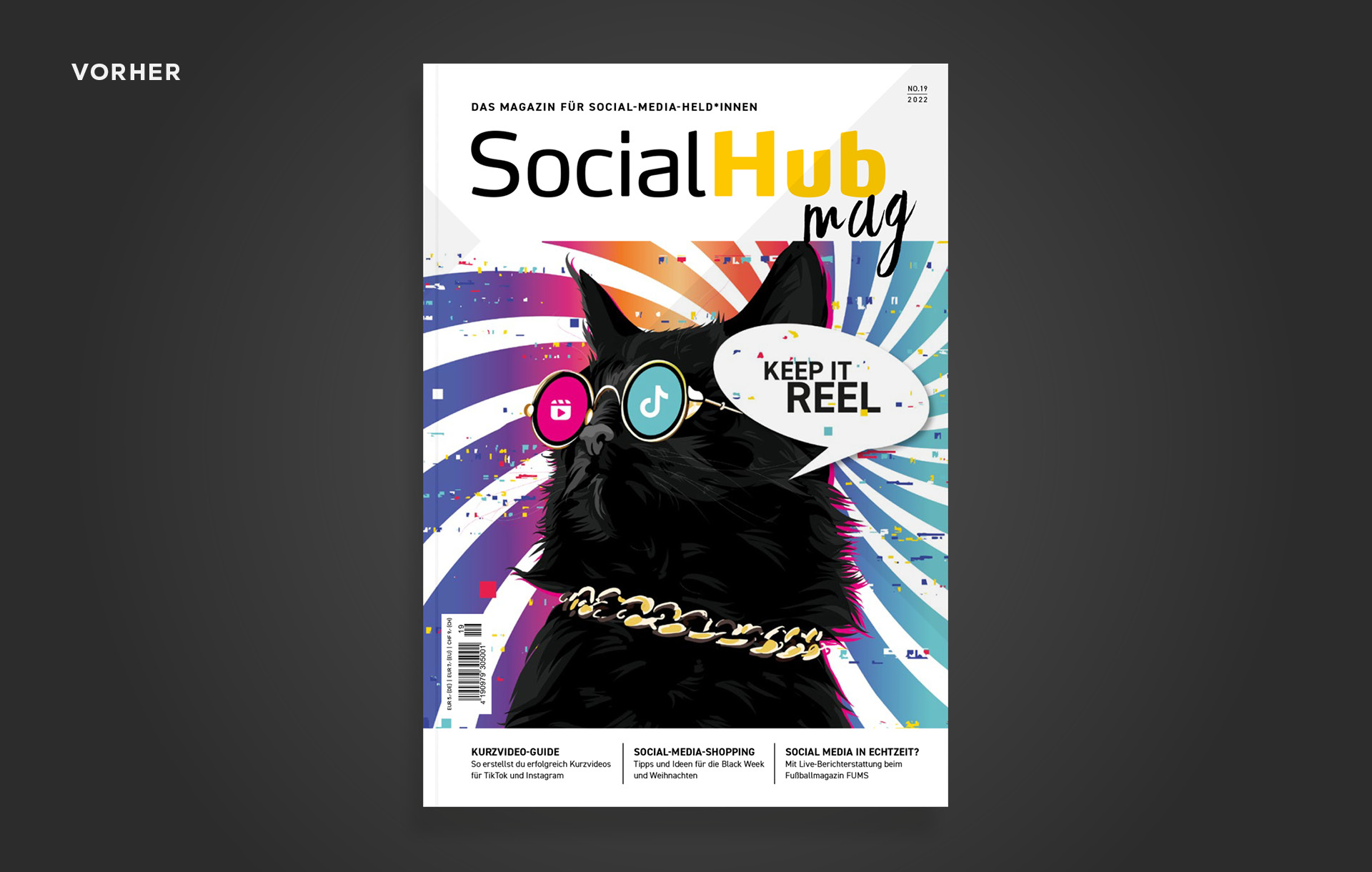
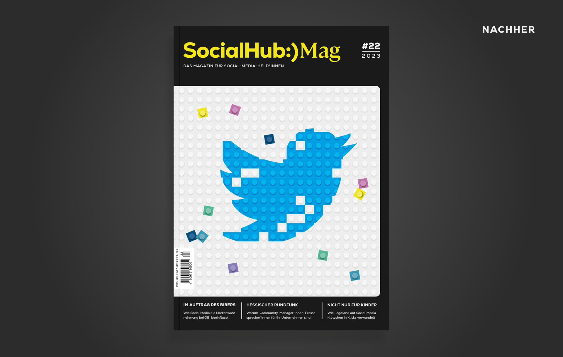
SocialHub Magazine
SocialHub magazine is the trade magazine for social media managers: by the community – for the community. The publication not only impresses in terms of content with strong interviews, tips and tricks, event information and a job exchange – as part of the brand sharpening, the magazine’s look has been adapted to the new design.

Website
The website is the central platform for explaining all the services of SocialHub’s software solution to interested parties. This is anything but dry or abstract: bright colours on a dark background, prominent KPIs, clear CTA buttons and vivid diagrams make the product benefits easy to understand. Meaningful icons, strong quotes and the animated ConnectionCloud liven up the structure of the individual pages time and again.
Digital applications
The dark background in Shadow Grey is particularly effective in digital applications. The primary and accent colours can unfold their full luminosity on it – whether as an Instagram post or PowerPoint presentation. The digital applications also offer numerous possibilities for animations: For example, the ConnectionCloud can also be brought to life as a pulsating design element.
