The dawn of a new era.
At the beginning of our collaboration with KESSEL was a question: How can we elevate the brand above the industry average while remaining faithful to its roots? The answers were already there – we just needed to bring them to light.
Starting basis
KESSEL has devoted itself to the brand core values quality, innovation, security, and service, or “QISS” for short. As early as the first discussions, we noted that these are more than fillers for sales presentations: As integral parts of the company culture, they guide the executive board in many important decisions, while also being the defining features of KESSEL’s product range. This is why we quickly agreed that the aligned brand identity would give even more weight to the values.
Analysis
In a workshop we got an overview of the brand and the media in which it operates. Based on this evaluation we put together six work packages corresponding to the corporate design’s various manifestations. We designed the work packages to be handled in subprojects with dedicated strategy, concept and implementation stages that would later flow together into the overall result.
Work packages
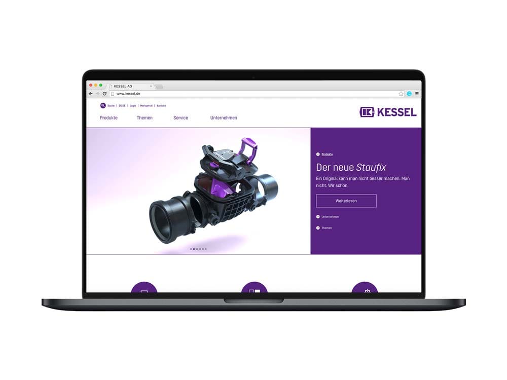
Digital
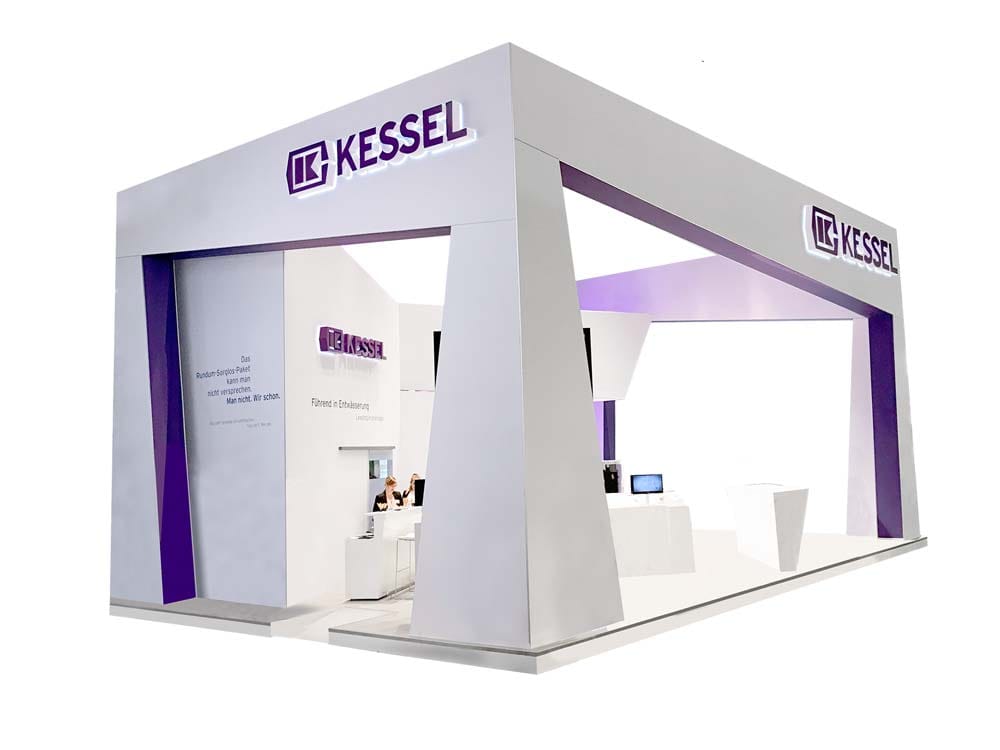
Space
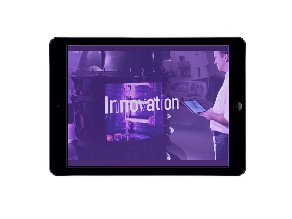
Video
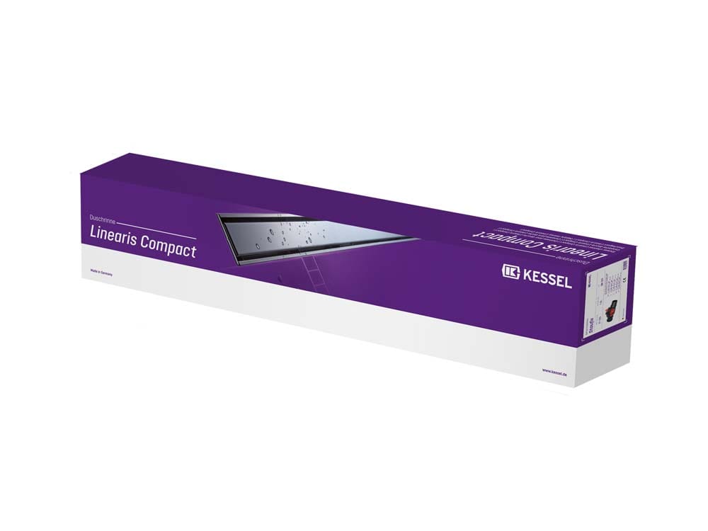
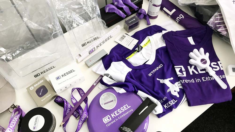
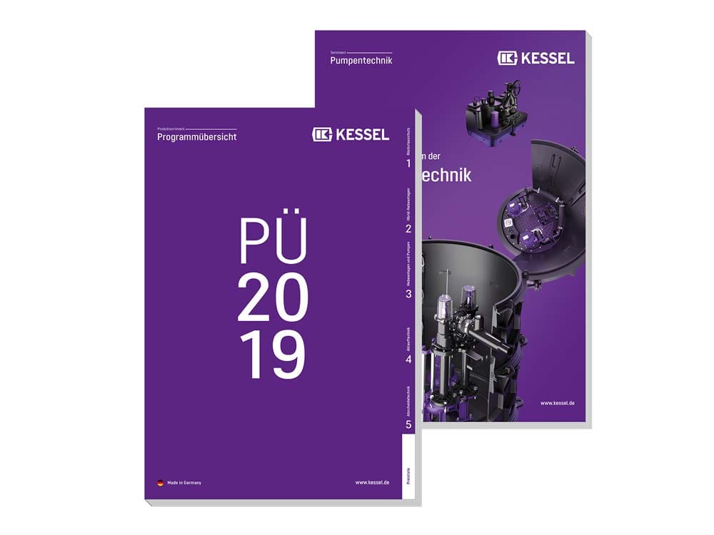
Advertising media
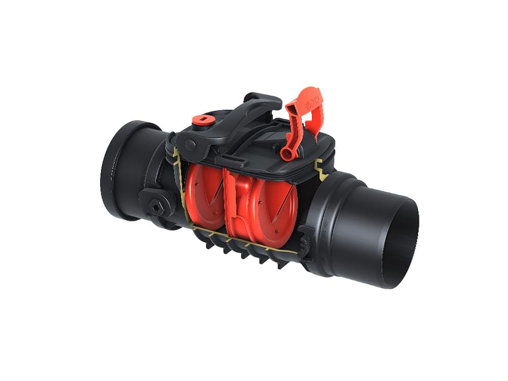
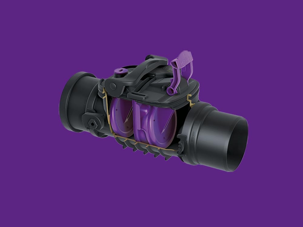
The best designs arise from a single, simple idea. In KESSEL’s case, it was taking the strong colour that’s already there and turning it into the brand’s central distinctive feature everywhere – meaning, no matter if in the logo or on the installed product.
Boris Schmelter
Management, Creative Direction
Colour concept