
The fine art of diversity.
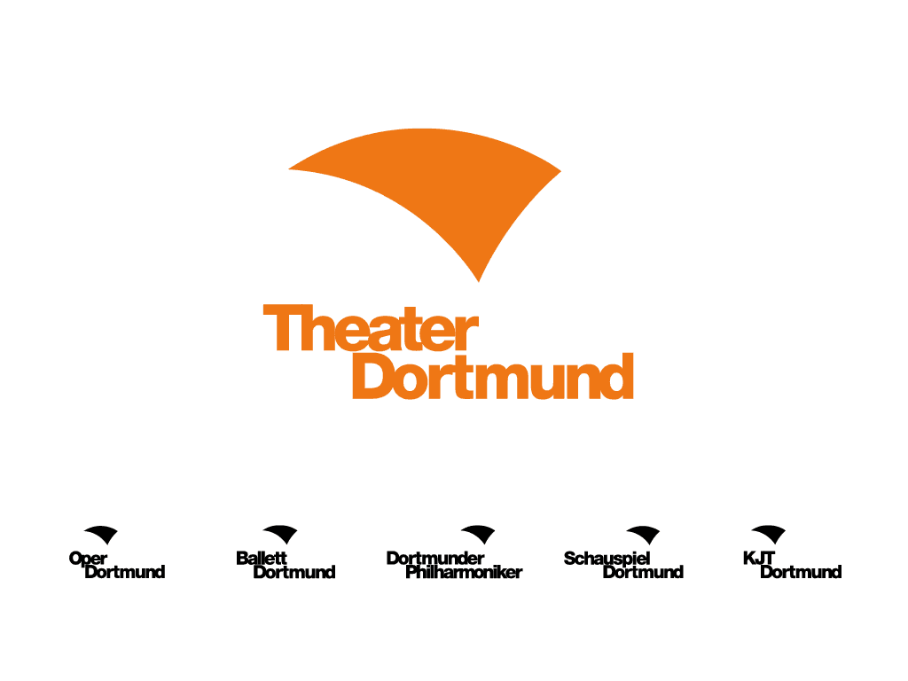
As one of Germany’s largest theatres, Theater Dortmund comprises five independent divisions under one roof – a challenge for the marketing department, which is responsible for both the umbrella brand’s and sub-brands’ communications. For support, the theatre turned to us in the run-up to the 2019/20 season.

German Design Award Winner 2020
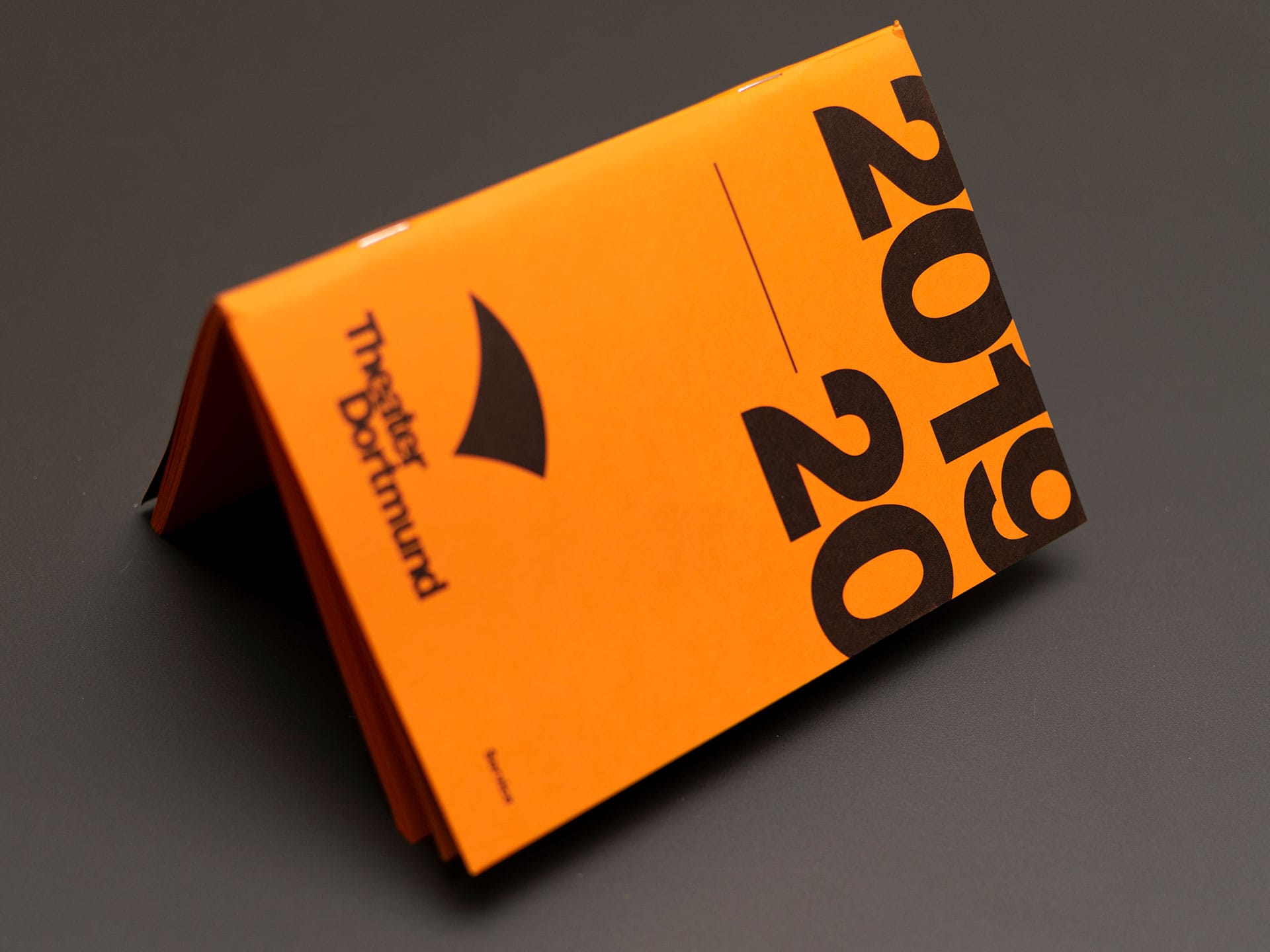
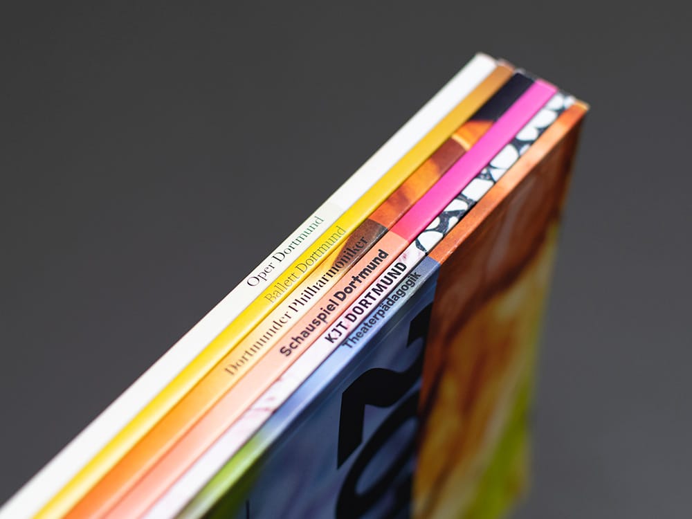
2019/20 season booklet
Every year, Theater Dortmund offers a comprehensive season preview in its most important print medium, the season booklet. We changed the overall concept for the 2019/20 season and, for the first time, designed the booklet as a collection of multiple individual publications.
Umbrella brand communications
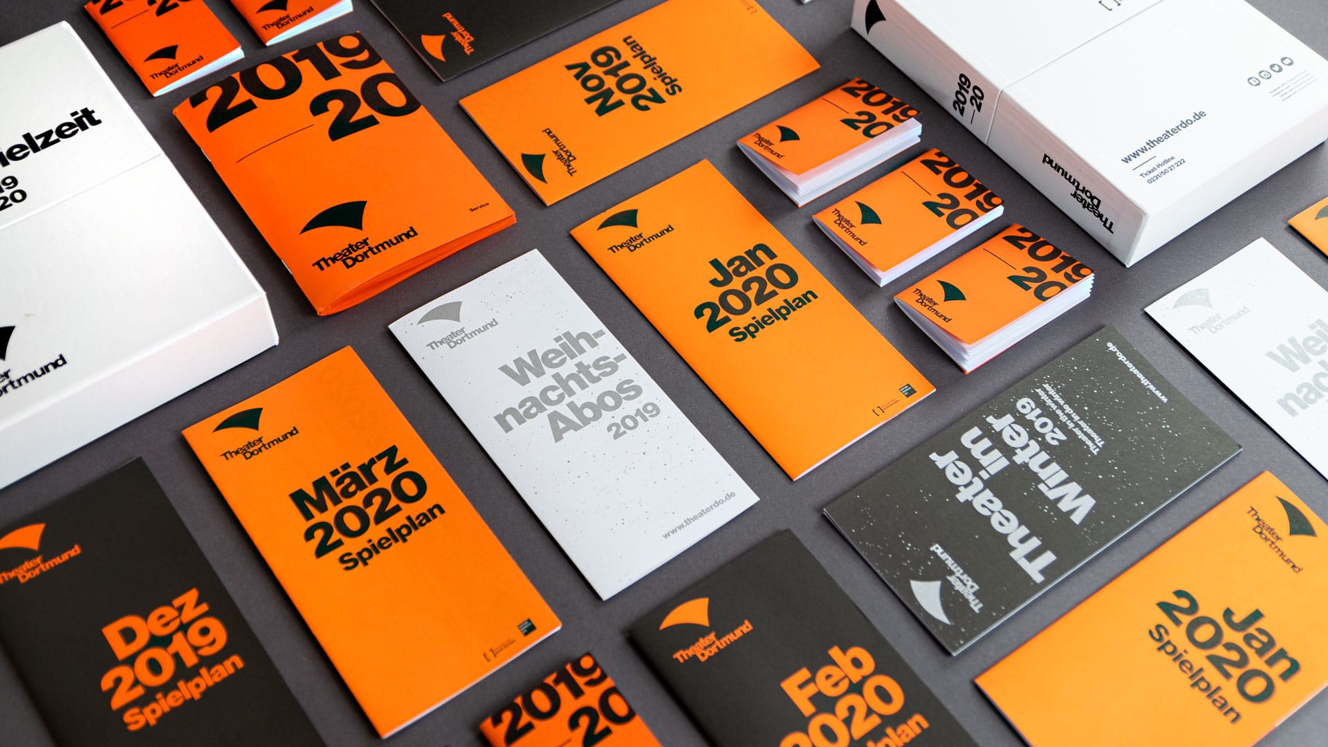
The umbrella brand gives Theater Dortmund a central communication platform. For its publications, we chose a straightforward, simple design approach and in doing so set it apart intentionally from the season booklets’ artistic “collage”.
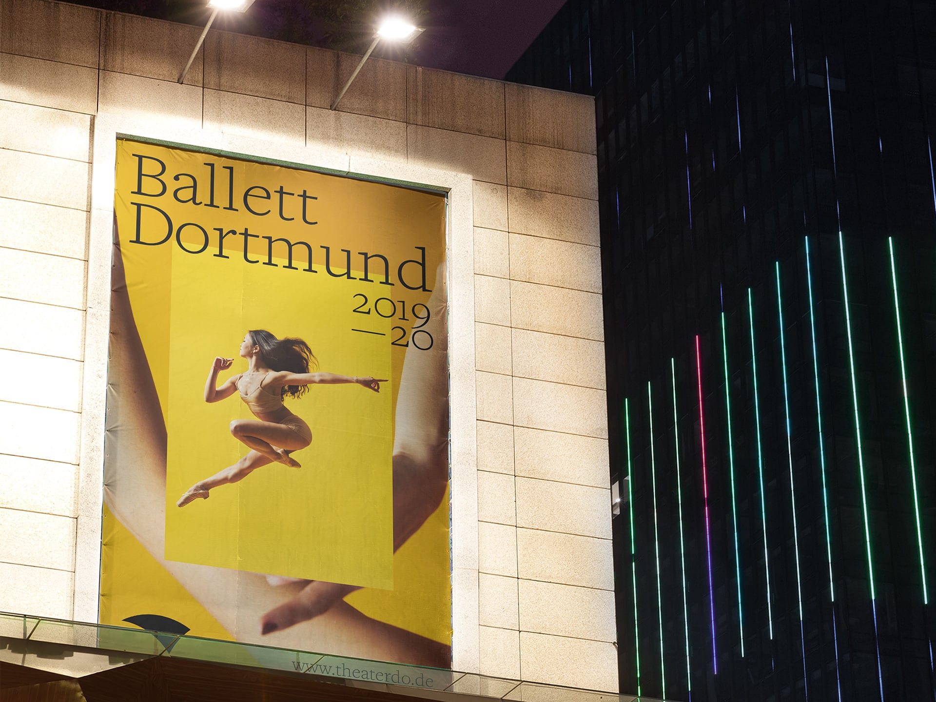
Campaigns
At Theater Dortmund, the line between ballet and opera is less blurry, perhaps, than elsewhere. We accounted for this fact with two campaigns that are just as different from each other as the two divisions. At the same time, the standardised grid clearly shows that both originate in the same organisation.