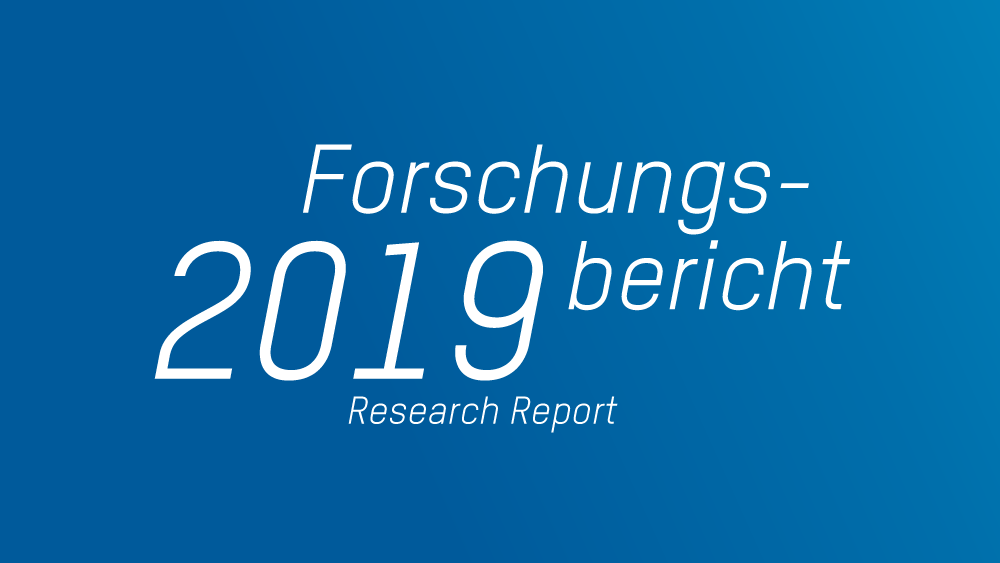
Future-minded brand design.
With its new brand design THI presents itself as it is: dynamic, technical, and modern. This impression is created by means of futuristic logos, fonts and graphics, saturated colours, and professionally produced images.

Fonts & colours
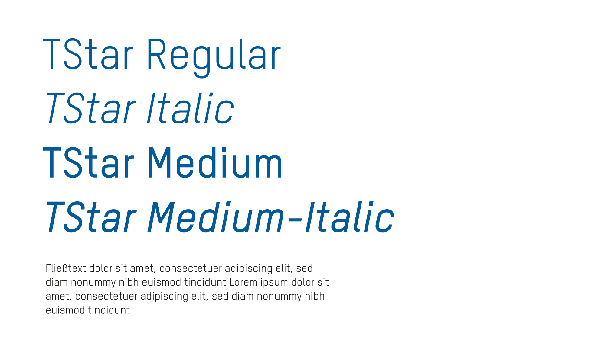
The T-Star font family with its combination of rounded shapes and straight lines reflects the combination of dynamism and technical precision which permeates the entire brand presence in keeping with THI’s claim Zukunft in Bewegung (“Future in motion”). The heavily saturated and high-contrast colours contribute to the modern look and feel and are also used to set the faculties apart from each other.

Imagery
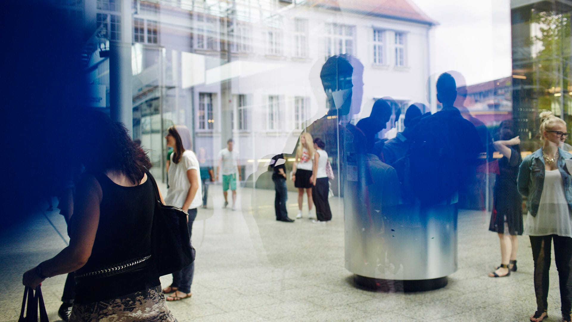
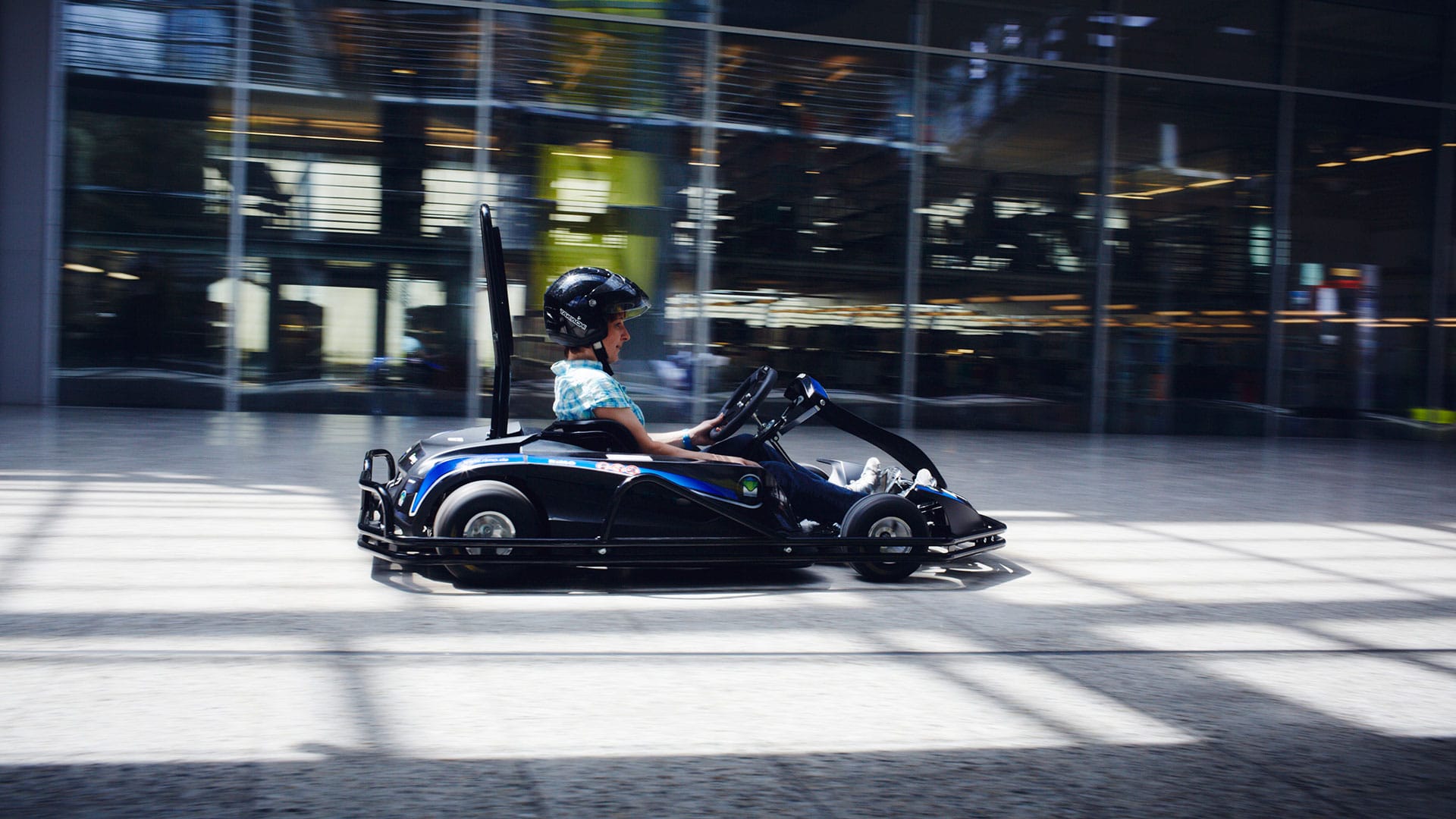
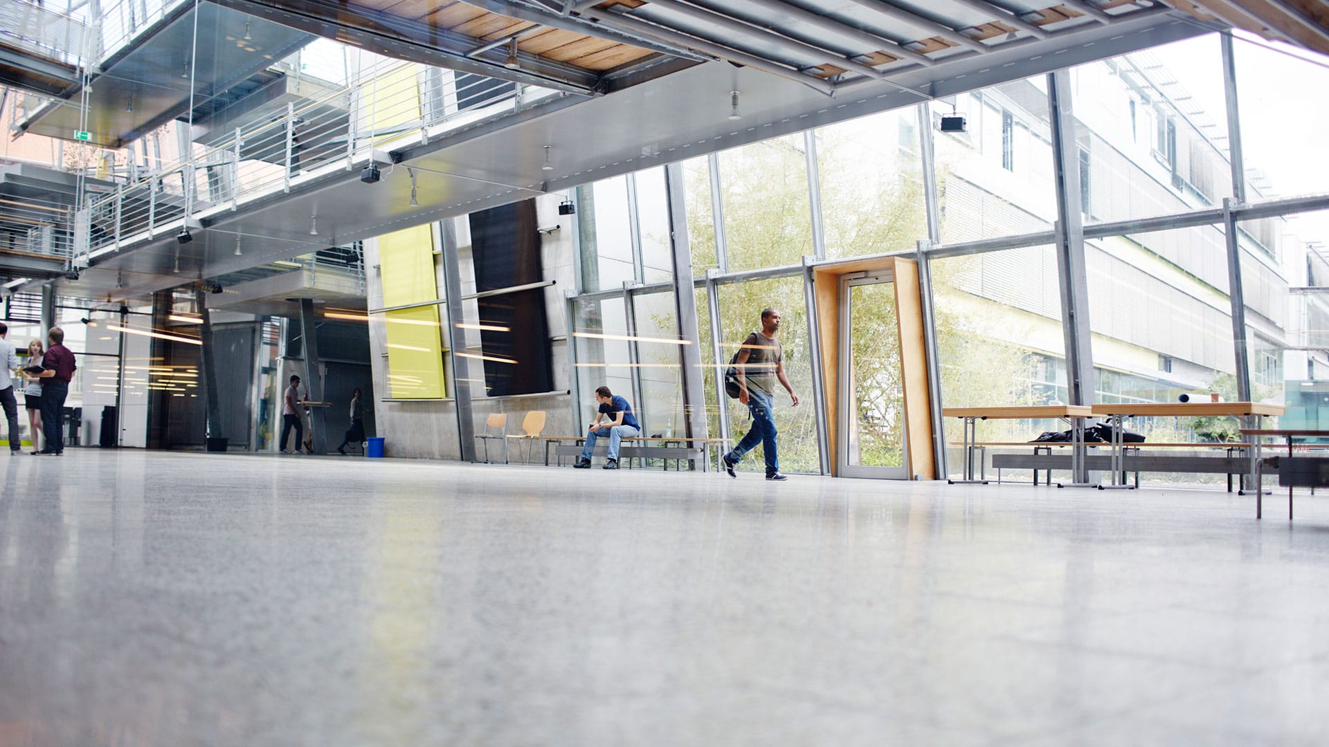
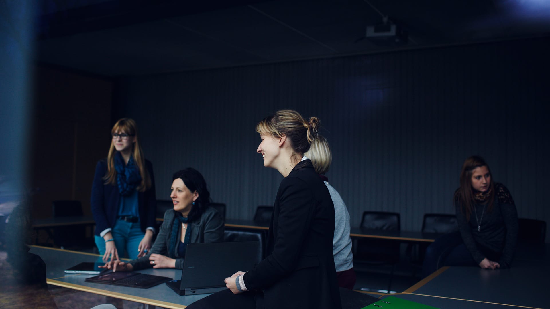
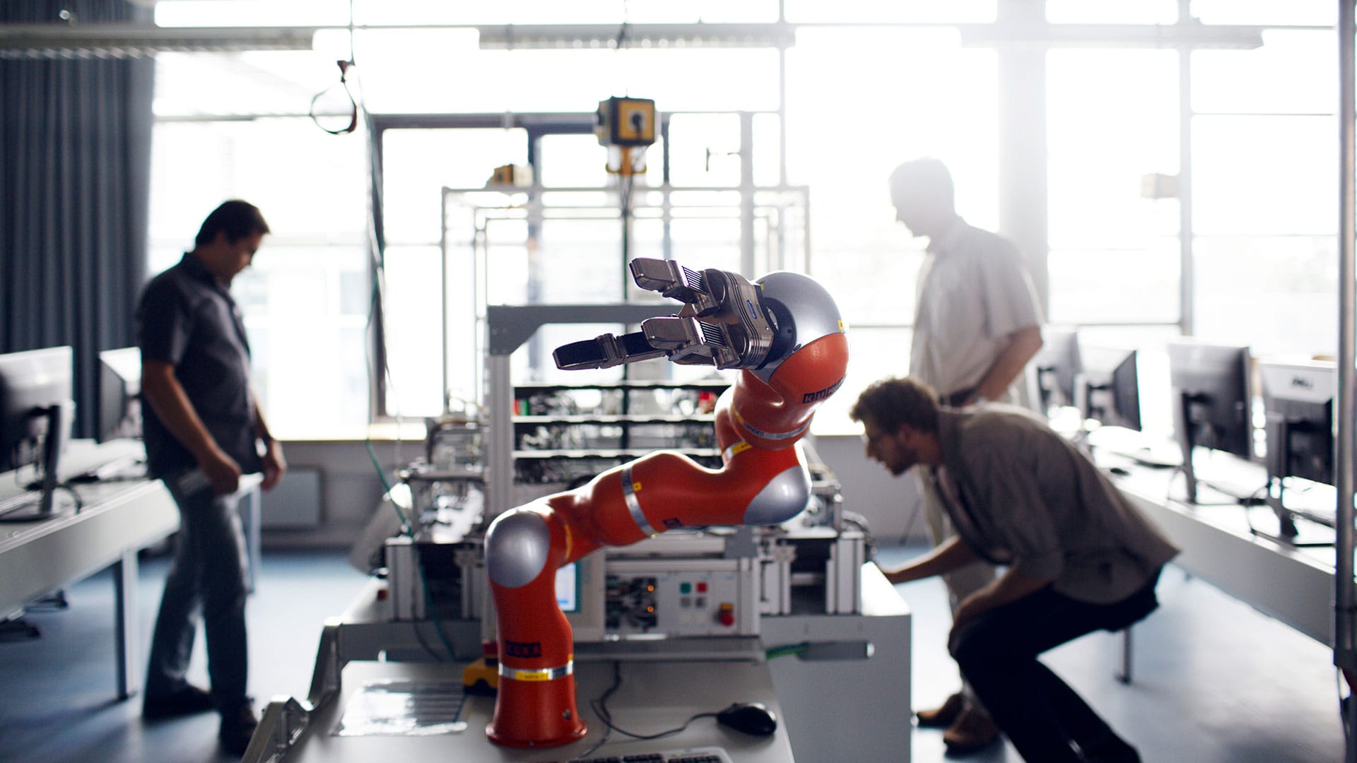
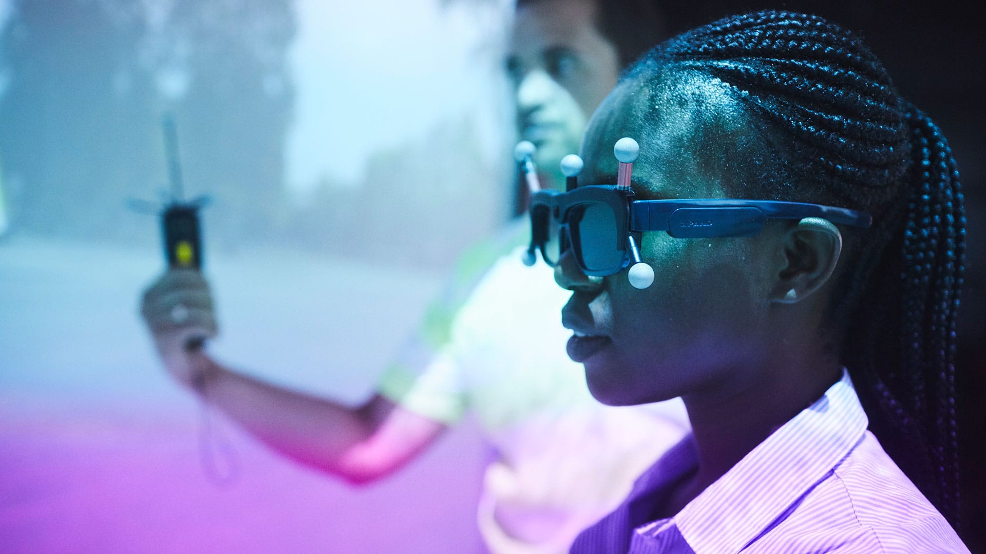
Images on a high technical and stylistic level enable interesting insights into the university’s day-to-day business. They focus on campus life on the one hand and the architecture on the other.

Graphics
The graphical style developed specifically for THI is based on clear morphology and strong colour contrasts. It is used to realise illustrative as well as informative representations effectively.

