The gateway to the Schneider brand world.
Brand communication is successful when it is consistent. To achieve this goal, we have created a central platform for Schneider Schreibgeräte GmbH that bundles all relevant brand information in one place: Welcome to the Schneider Brand Portal.
The task
Schneider Schreibgeräte GmbH’s brand communication is complex: there are a total of three different product areas, a wide variety of communication channels and media formats as well as numerous people involved in the individual processes. In order to enable consistent brand communication, a tool was needed that bundles all the important information, can be easily kept up to date and is accessible to everyone involved.
Our unique brand identity sets us apart. However, we can only be recognized outside the company with a complete brand appearance. Our own brand portal was therefore the logical next step for consistent brand communication.
Stephan Lauble
Head of Product Management, Schneider Schreibgeräte GmbH
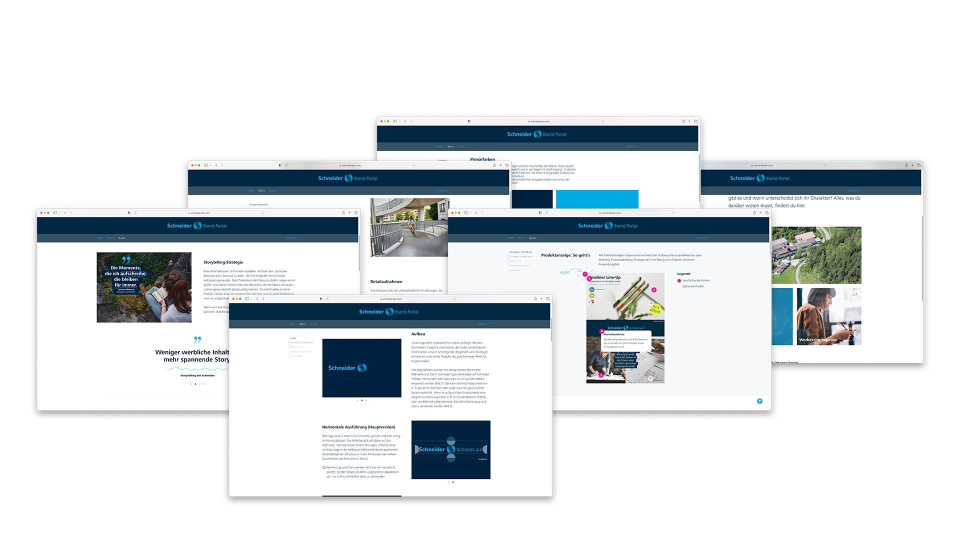
Thematic navigation
Whether it’s the background to the brand architecture, the structure of animations or the CMYK values of the corporate colors: a brand portal bundles a wide variety of information in one place. Structuring this in such a way that the desired content can be found in the shortest possible time is a particular challenge. The Schneider Brand Portal is therefore divided into three central areas: Under “Brand” you can find everything that characterizes Schneider as a company and the individual product lines. The “Basics” section provides basic information on the individual product areas. The “Guides”, on the other hand, provide specific instructions on how brand communication should be implemented in detail.
Three product areas
Schneider’s product range has grown steadily over the decades. As a result, brand communication has also become more diverse. Nevertheless, it shares a common basis: common roots and unifying brand values. However, these are weighted differently depending on the product area. The “Write & Mark/Highlight” area is constantly rediscovering creativity in everyday life, while the Makers Line is more unconventional in DIY style and the promotional pen area is more businesslike and serious in the B2B environment.

Fundamental basics
What does the logo look like and how is it placed? Which colors are allowed? Which fonts may be used and when? All important basics relating to the brand can be found in the “Basics” section. From the brand banderole and guidelines for image photography to firmly defined spellings, all the information you need for successful brand communication is stored here – in a user-friendly and clear way.

Helpful guides
How is Schneider’s brand DNA ultimately transported in the various media formats? Specific guides on topics such as storytelling or sustainability communication or on selected means of communication reveal this. Practical instructions show, for example, how to implement the storytelling strategy step by step or how to design catalog pages, posters or online banners in line with the CI. This makes Schneider’s brand identity approachable and comprehensible.
Useful sample files
Sample files are available to download for common media formats such as covers, advertisements or online banners. These already contain all the important brand elements such as corporate colors, fonts in the correct formatting as well as quotes or the brand banderole. This not only saves time when setting up – it also minimizes sources of error that can arise when designing yourself.


Optimized for all devices
Brand knowledge to go – would be pretty useful? No problem! The entire brand portal is mobile-optimized, so you can look up colour values, fonts, etc. quickly and easily on your smartphone or tablet.


