A clear-cut creative course.
TENGLER WERBEMANUFAKTUR’s new brand presence compels with a clear design concept that still leaves enough room for creative surprises. This adds up to an overall impression in form and colour that is as multifaceted as it is clearly recognisable.
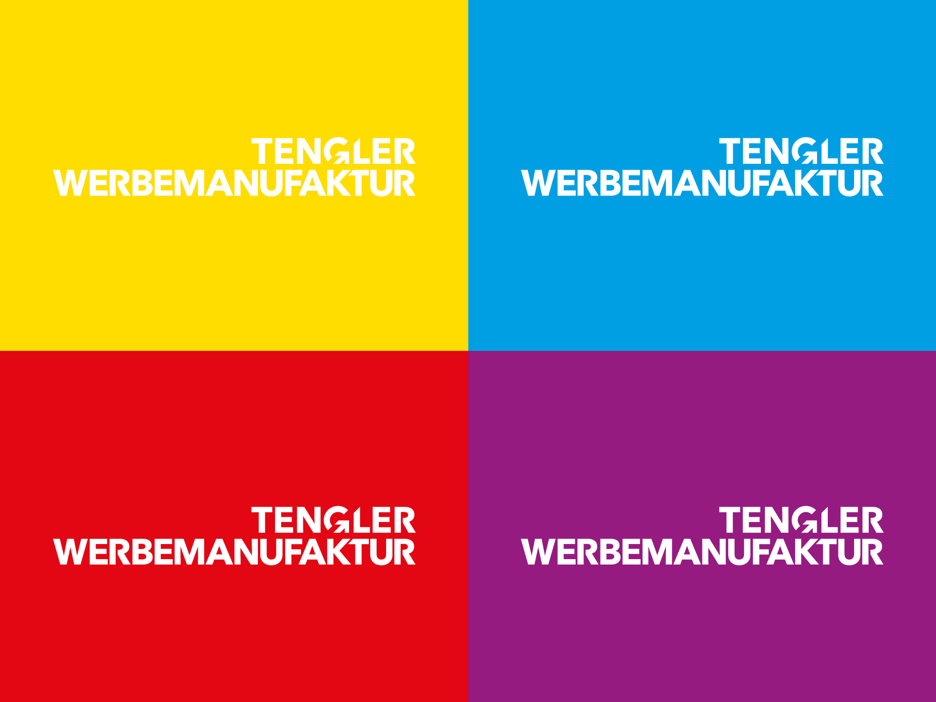
Logo
We designed the logo as a word mark that presents the new name effectively. The “G” composed of geometrical forms brings the family name into focus and increases the recognition value. Its components, a semicircle and an arrow, are used as playful, freely arrangable elements throughout the entire brand presence.
Colours
Typography
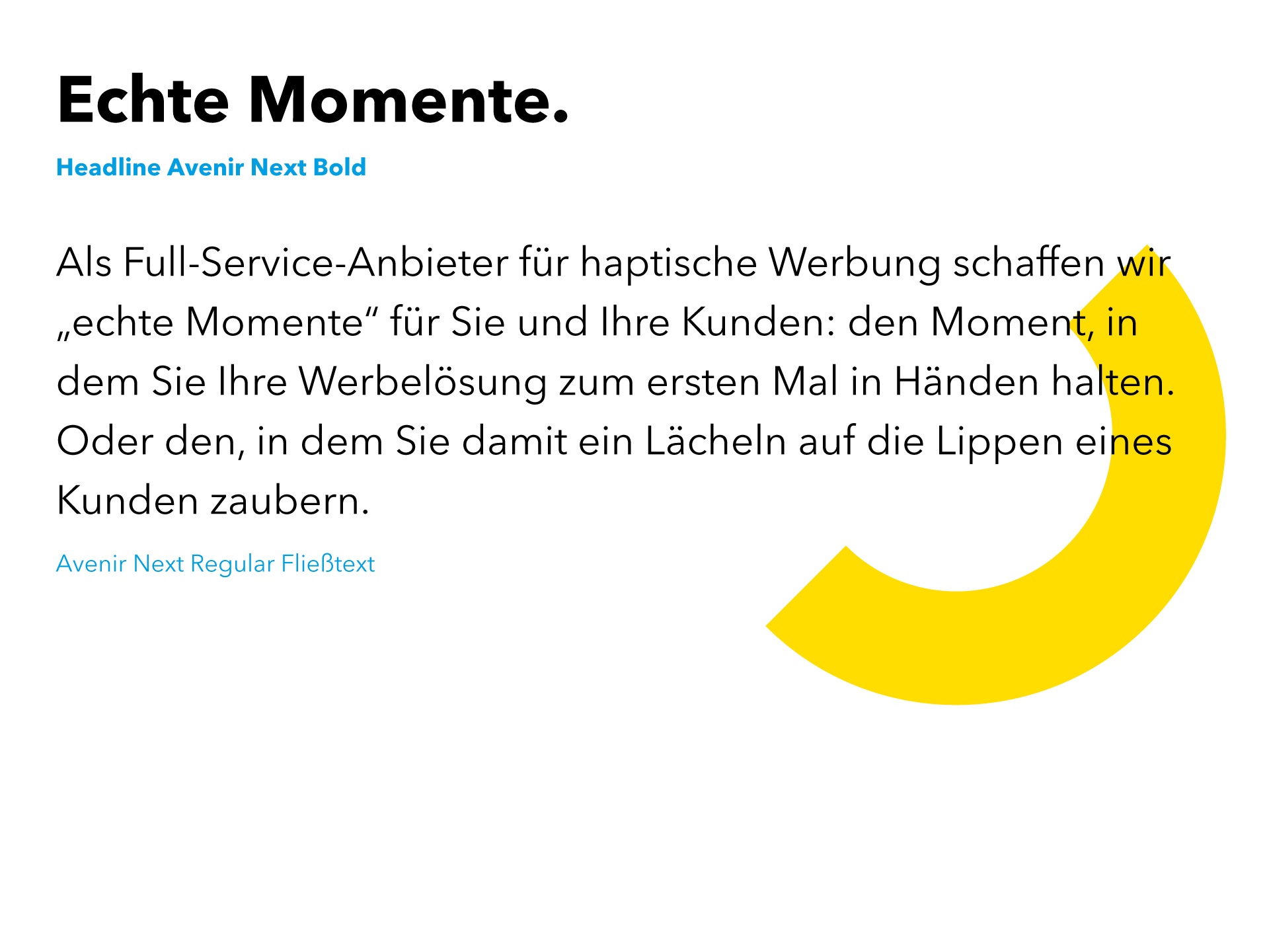
Layout elements
The playful elements derived from the logo can be used freely. This results in many different layouts and designs whose consistency is ensured by the standardised colour scheme and morphology.

Imagery