A sub-brand for self-mades.
At the start of the project it was still anybody’s guess how the new products would be marketed. We showed Schneider possible ways of locating them in the brand architecture – and eventually decided together to clearly distinguish them from the standard line-up with a dedicated, self-made-style sub-brand.
Brand elements
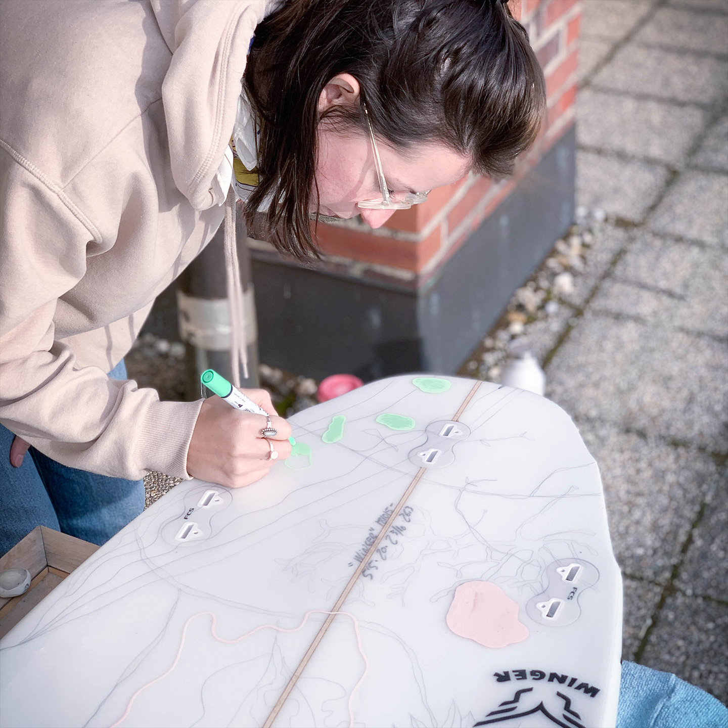
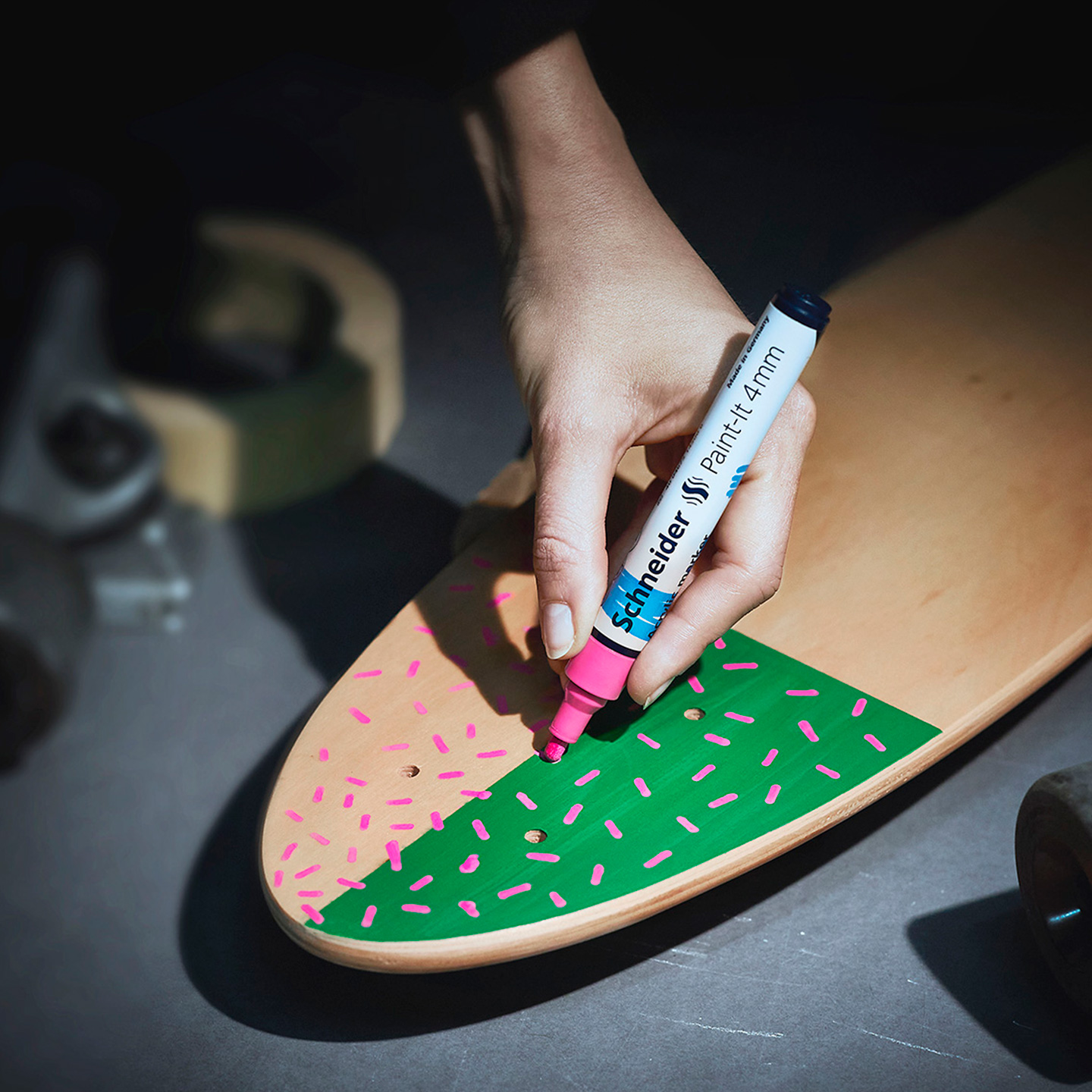
After the decision to launch a sub-brand had been made, we developed all brand elements including the name “Makers Line”, the imagery and morphology as well as the handwriting-style typography. The result is a deliberately rough look and feel that invites users to give free rein to their imagination.
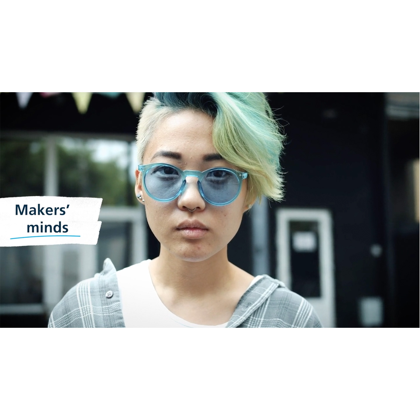
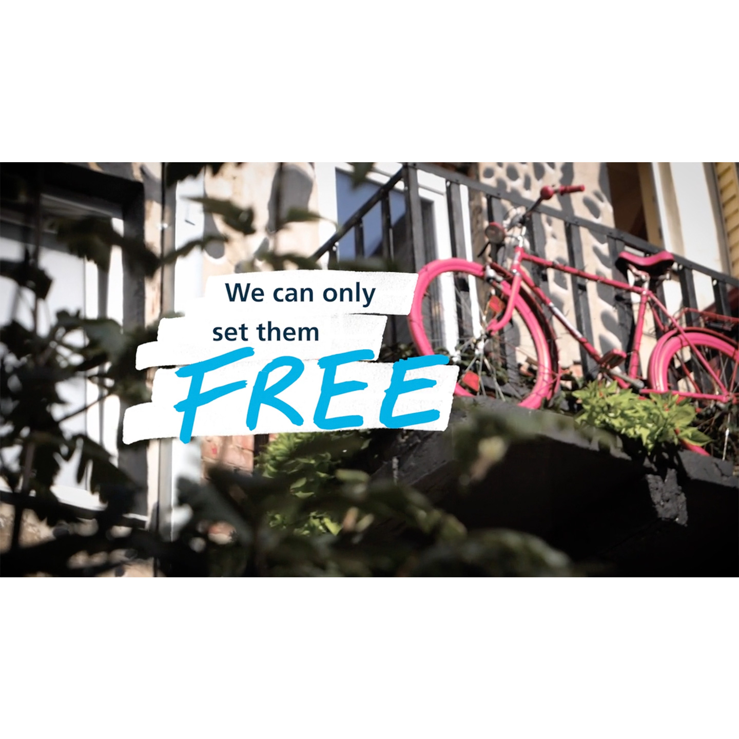
Schneider doesn’t just chase the DIY trend. They take the target group seriously, value its creative individuality and provide high-quality tools to act it out.
Paloma Suck
Senior Art Direction
Positioning
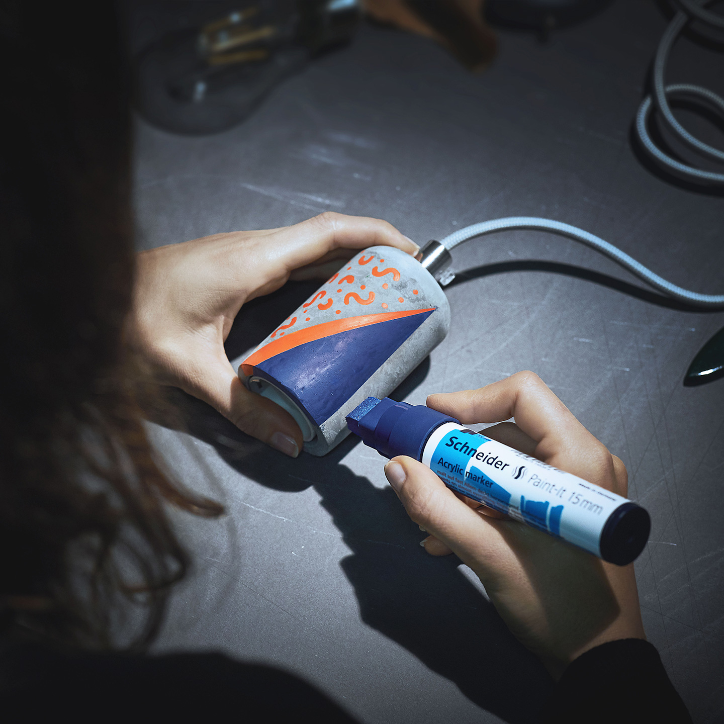
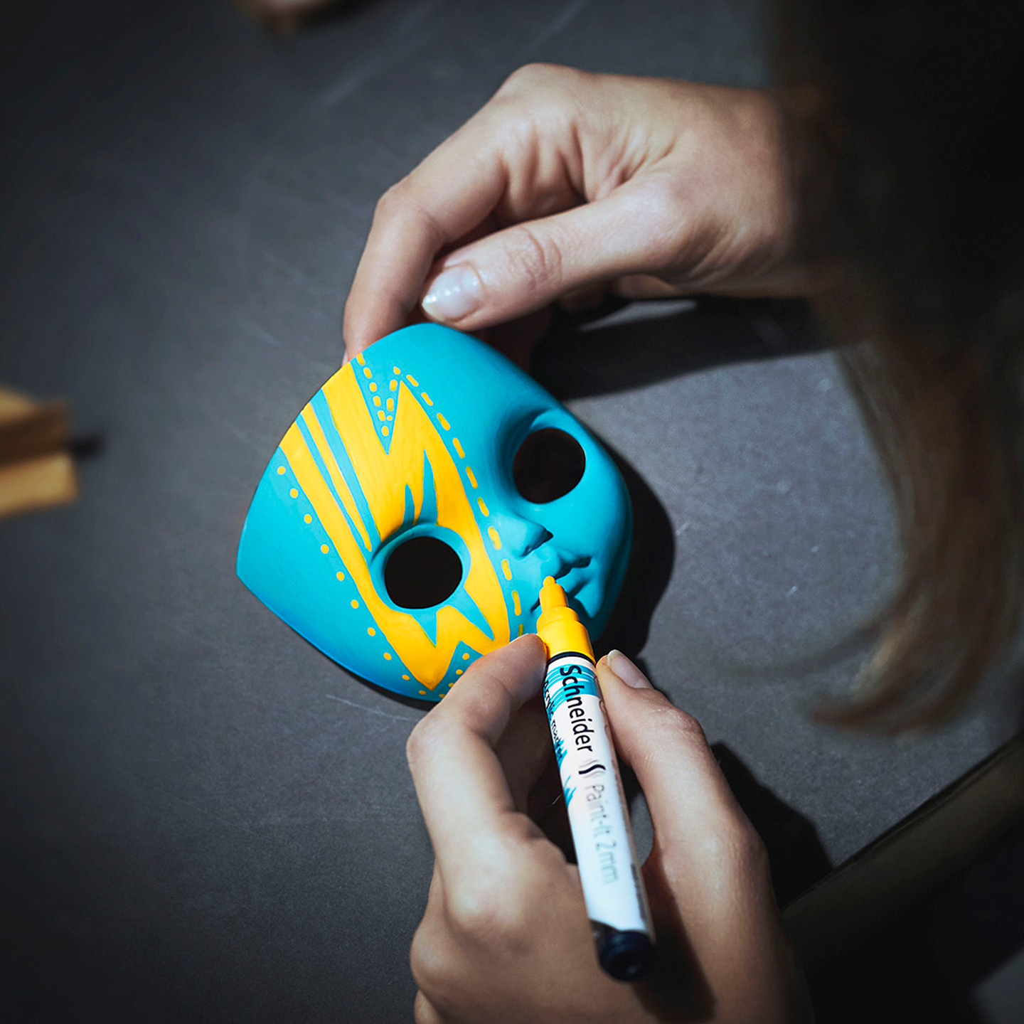
The Makers Line is aimed at young, idealistic amateur artists who pursue do-it-yourself projects as a form of anti-consumerism and daily diversion. We thus set it apart from products made exclusively for fun or professionals and engage the target group directly to encourage them to actively co-create the brand identity.

Synergies in the Black Forest
As family businesses from the Black Forest, Schneider and MOLOTOW don’t just have a common heritage – both represent high-quality writing and painting instruments made in Germany. They share their respective know-how collaboratively and develop new ideas together. Strong and highly innovative product line-ups are just one result of this close cooperation. Correspondingly, the Schneider Makers Line contains MOLOTOW’s technological know-how.
(FLTR) Frank Groß (Schneider), Jürgen Feuerstein (MOLOTOW), Christian Schneider (Schneider), Ulrike Ringwald (MOLOTOW)