The recipe: a refreshing treatment.
Tradition is revitalised! Letting go of the superfluous, shaping the established and setting new impulses: this is how we have made Klinge Pharma’s brand image fit for the future.
Farbwelt
Klinge Pharma ist straight-forward und geradeheraus. Diese Haltung vermitteln auch die Hausfarben: leuchtend, stark und unkonventionell. Mit Klinge Blue setzt sich der Pharmahersteller uns mutig von der Konkurrenz ab. Für kräftige Akzente sorgen Highlight Peach und Highlight Blue. Das zurückhaltende Light Grey rundet die Farbwelt ab und gibt Hintergrundflächen festen Halt.
Typography
The new corporate typeface is Figtree, which impresses with both its clarity and its characteristic features. Its modern practicality allows more freedom in the design. Extra-large headlines, the play with weights and various labelling options create a lively typeface.
Logo
The brand: outstandingly strong. The logo: unmistakable. That’s why the shape remained unchanged, but the colours were given a fresh and modern update. Klinge Pharma now confidently positions itself as the sender in the bright Klinge Blue colour.
Unique design element
The Aesculapian staff is an important part of the logo. In the form of an abstract snake, the Aesculapian snake characterises all communication media as a design element. It symbolises the mindset of Klinge Pharma: modern, dynamic and always on the rise.
Product presentations
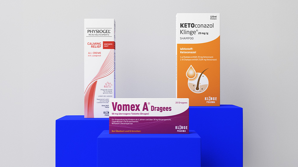
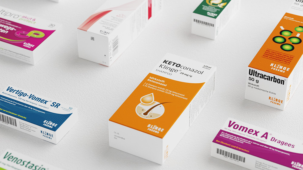
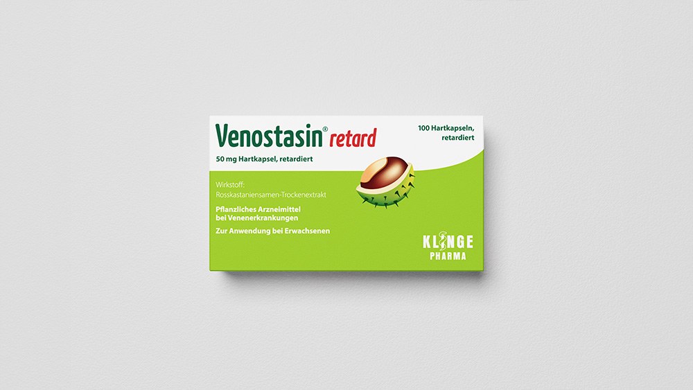
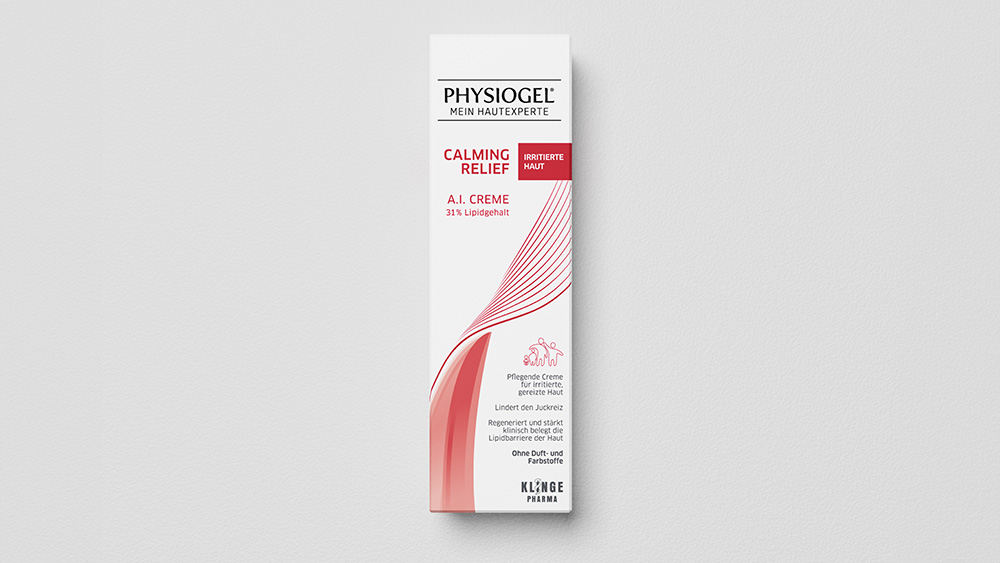
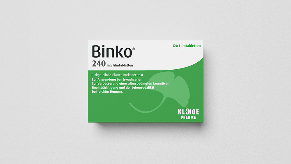
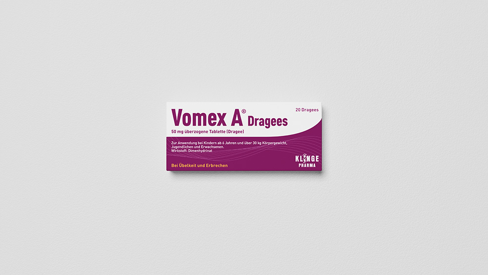
Vomex A, Physiogel, Venostasin or Lingumelt: The product portfolio includes a wide range of products for various indications. Each of these individual products represents an independent sub-brand. The challenge was to summarise the resulting heterogeneous image material in a uniform look.
Organised and balanced: this is how Klinge Pharma will present its products from now on. Individual packaging is presented lying on a light grey background. If several packages are shown within one motif, there is greater creative freedom. Other perspectives, staggering and coloured bases are permitted here.
Flexible design principles
Instead of a rigidly standardised system of rules, overarching design principles apply when dealing with the individual design elements in order to adapt the corporate design for different media formats and communication channels. The different design elements can thus be flexibly combined with each other without losing the unique look of the brand identity.
