Remarkably understated.
Based on the principles of purism, functionality and class, we developed the Excellent Line brand design. It maintains a low profile much like the stands themselves.

Logo
The logo is derived from the product characteristics: the black square corresponds to the baseplates’ shape while the white lines in the form of the implied initial letters E and L represent the modular construction. The elegant design mark can be found in places such as the stand bases, where it is engraved as a final indicator of the products’ superior quality.

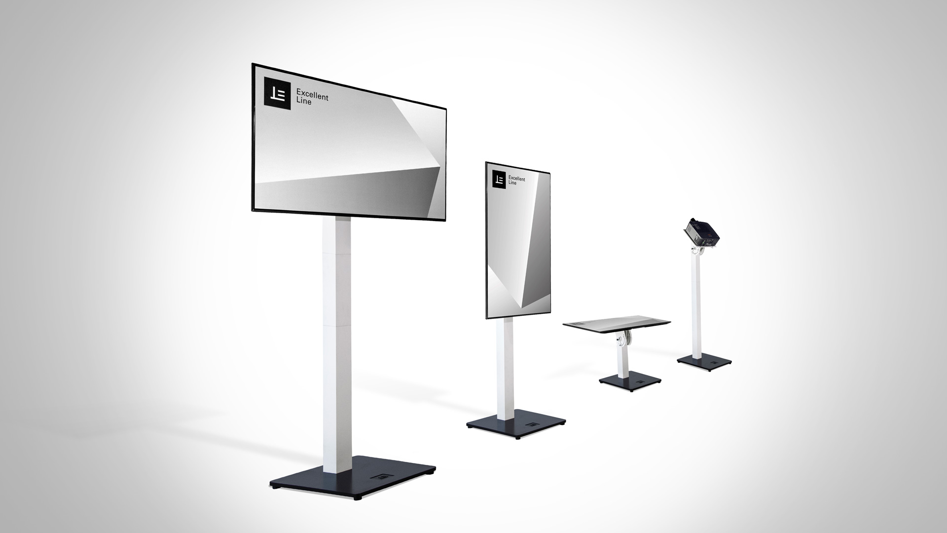
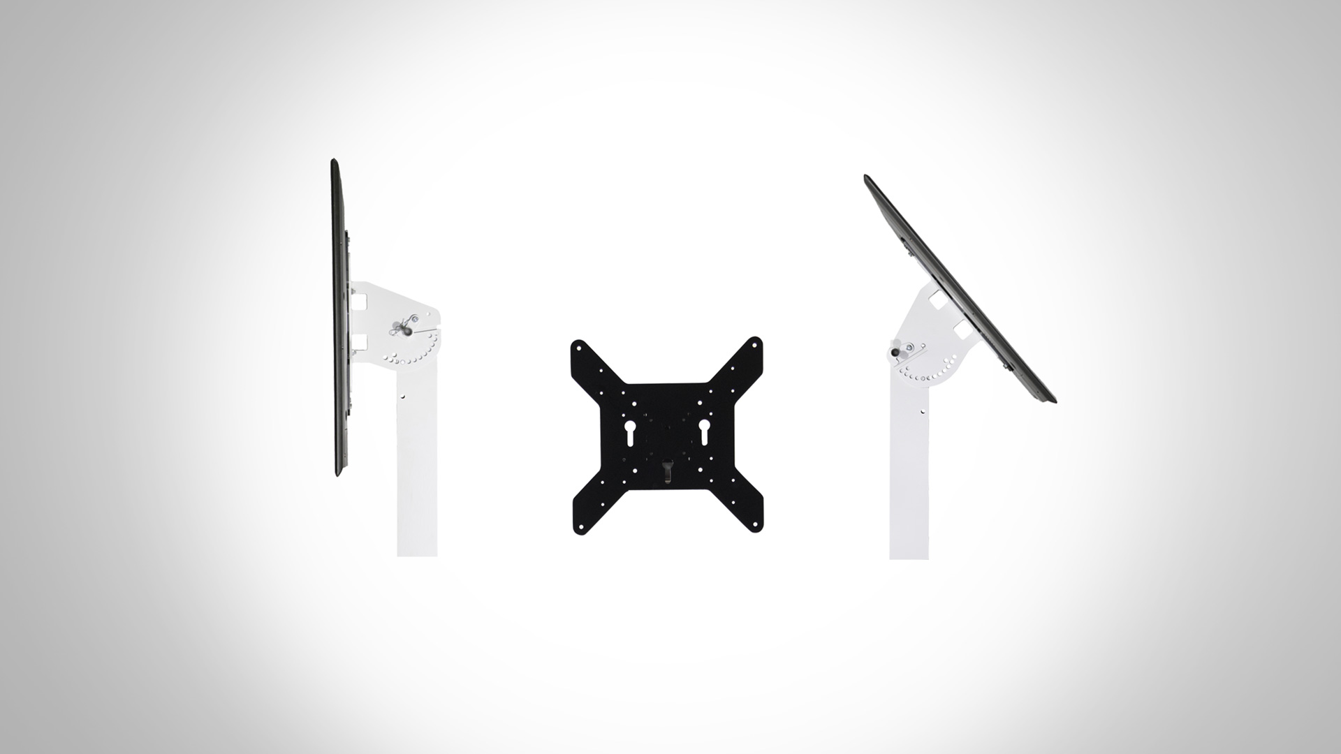
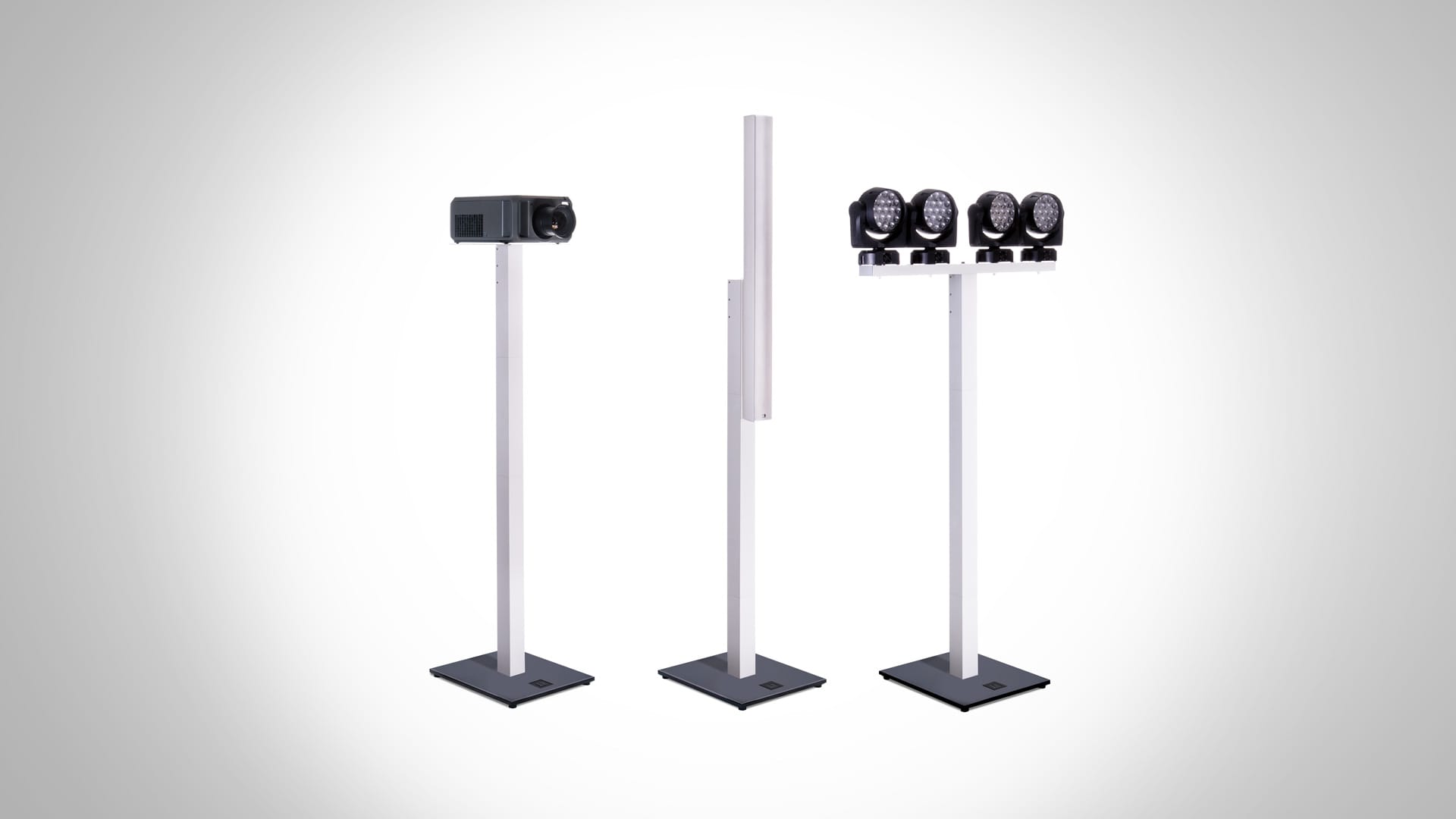
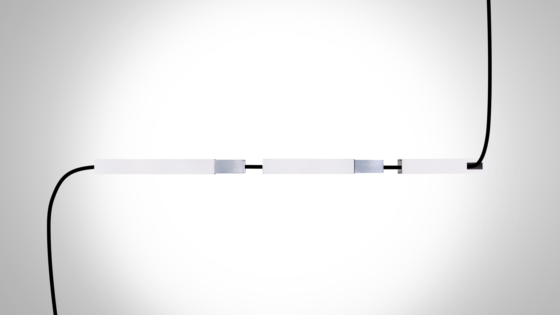
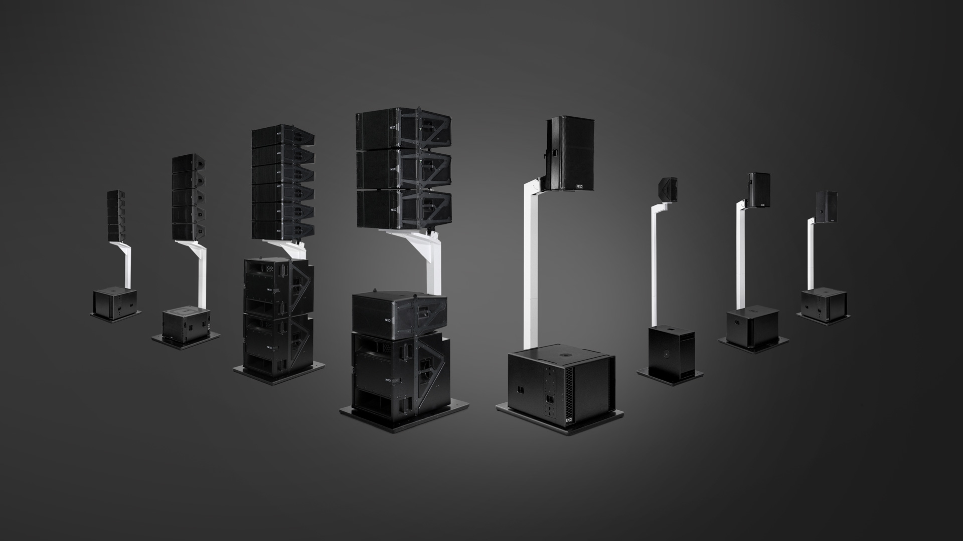
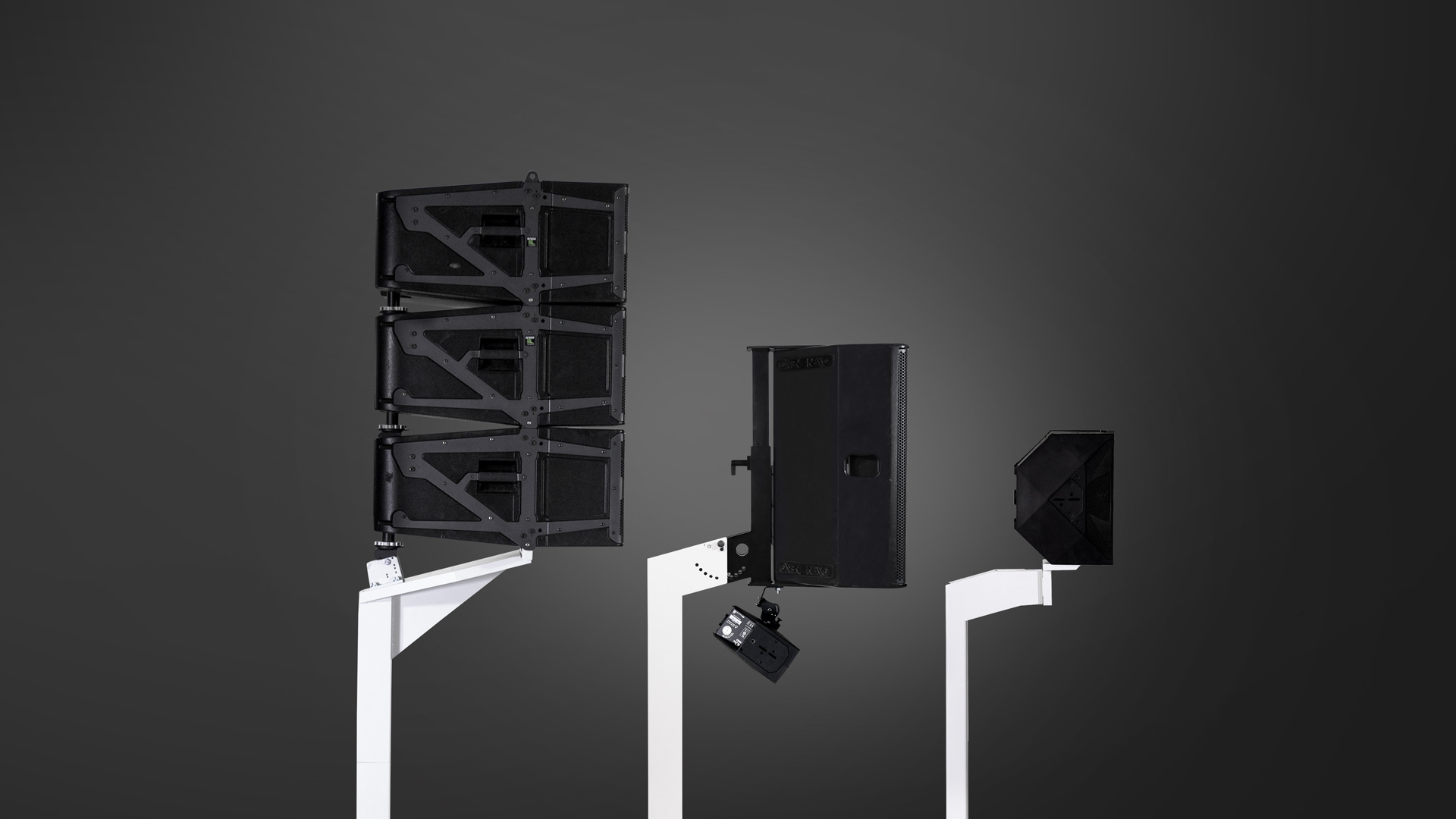
Product photography
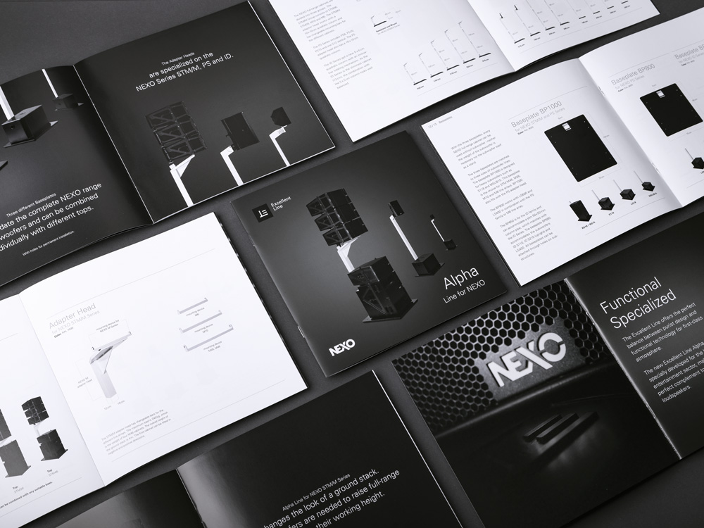
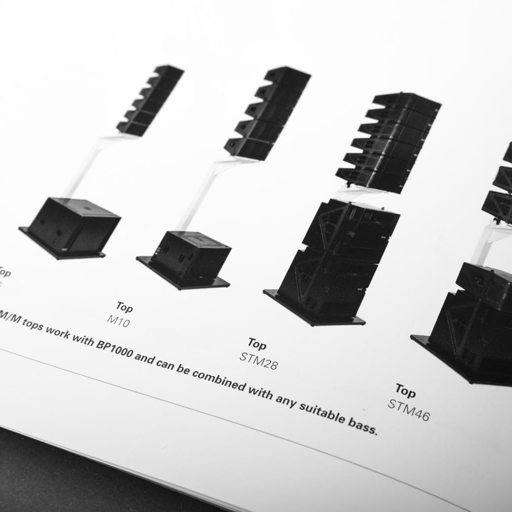
The products are brought into focus in all media by means of lavishly produced photos whose aesthetics follow the brand values. The biggest challenge here is to present various products differing greatly in size and function in a consistent, appealing style.
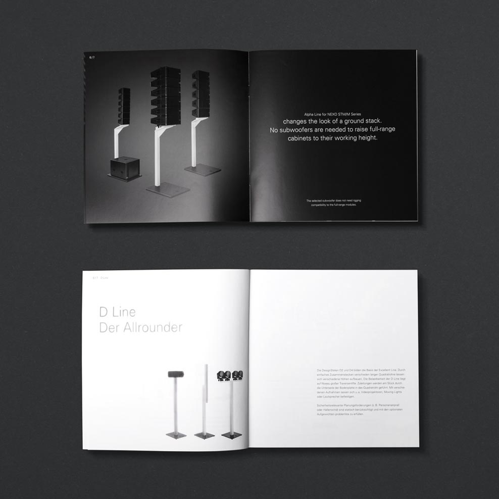
Print media
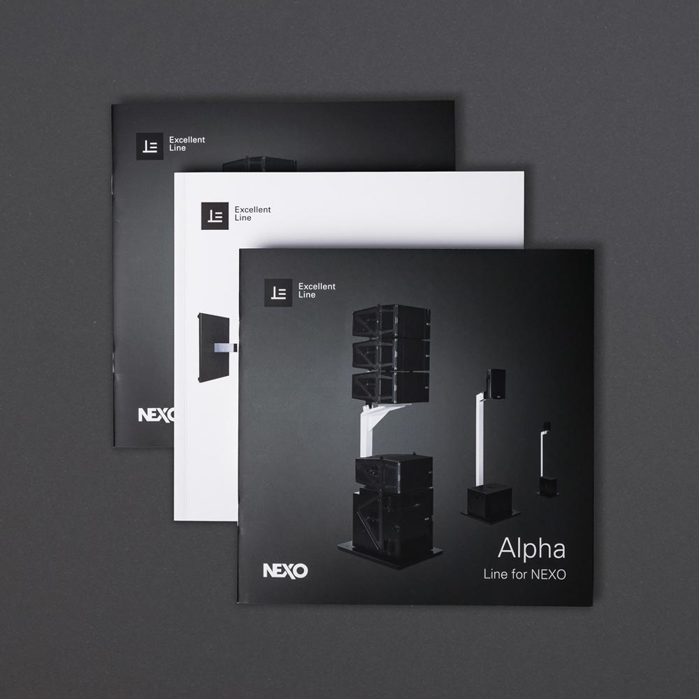
Excellent Line print media present the elegant products and their most important characteristics effectively while also showing more in-depth information about the range of functions and technical specifications.