An evolved look. Unmistakably Schneider.
What should stay, what can go, and what simply needs a breath of fresh air? All brand elements were carefully reviewed in order to ultimately develop a flexible, fresh and contemporary brand design.
Logo
As part of the brand refresh, the fixed link between the brand claim and the word mark was broken. The brand banderole was thus transformed into a dynamic logo badge reminiscent of a ballpoint pen clip. At the same time, the figurative mark was simplified and optimised for digital display.
Logo placement
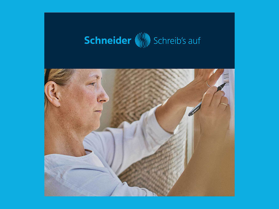
2010
The large-scale brand sleeve was an integral part of every layout. This rigid design was no longer able to meet the demands of the digital world.
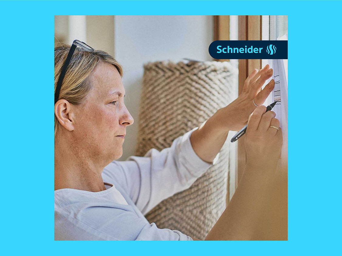
2025
The logo badge is much more flexible in its application and leaves significantly more space for the actual content. This gives the overall look a much airier, lighter and more modern feel.

Typography
The house typeface TT Norms Pro Compact has a meticulously crafted appearance. This technical style is softened by gentle curves and swerves, creating a unique character: precise yet with a human touch.
Colours
For generations, blue has been the number one colour for writing in Germany. This is also reflected in Schneider’s colour scheme, which features a palette of distinctive shades of blue that can be used both as solid colours and in gradients. The corporate colours were refreshed as part of the brand refresh and optimised for digital media.

Visual imagery
The imagery captures what matters most: authentic moments, the power of creativity and outstanding product quality. The images depict real-life situations of people who work, live and create using Schneider writing instruments.
Faces of creativity
Schneider is synonymous with high-quality writing instruments – but it is the people behind them who make the products truly special. Powerful imagery captures their world, their creativity and their inner drive: emotional, touching and on a human level.


Products and their uses
With Schneider writing instruments, the possibilities are endless – from jotting down a quick note to tackling a DIY project. To showcase this range, the products are presented in natural, everyday situations and real-life scenarios: realistic, lively and authentic.
Design system
The design system is so flexible that it works regardless of the communication channel or medium. Plenty of white space and a focused, uncluttered design convey a sense of lightness and modernity. The graphic toolkit also offers a range of design elements to create varied and unique layouts.

Circle Cut
The Circle Cut is used in the branding of Schneider Write and Schneider Promote. This rounded corner can be applied to both images and colour blocks.
Matter Lines
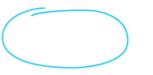
The hand-drawn lines give the brand’s communication a more human and lively feel. They can be used to highlight key points effectively.
Create Brushes
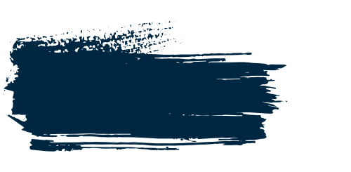
The Create Brushes are designed to highlight the unconventional side of Schneider Create. They can be used to create large areas of colour or placed as individual elements.
Brand Portal
Brand communication is successful when it is consistent. To achieve this goal, we have created a central platform that brings together all relevant brand information in one place: the Schneider Brand Portal. It contains a wealth of practical guides and tools, such as the logo generator, which make working with the brand design as straightforward as possible.
