A controlled start.
We developed the abiga brand along a clearly outlined path from strategy to naming, logo and claim to brand design. This enabled the start-up to enter the market in the best possible condition.
Naming
In true start-up style, the new brand’s name “abiga” is a memorable, uncomplicated neologism. The combination of soft consonants and open, symmetrically arranged vocals appears friendly and self-contained – just like the company’s comprehensive service. The name is derived, by the way, from the German service description Abwasserdienstleistungen für gewerbliche Anwendungen (“Wastewater services for commercial applications”).

Logo
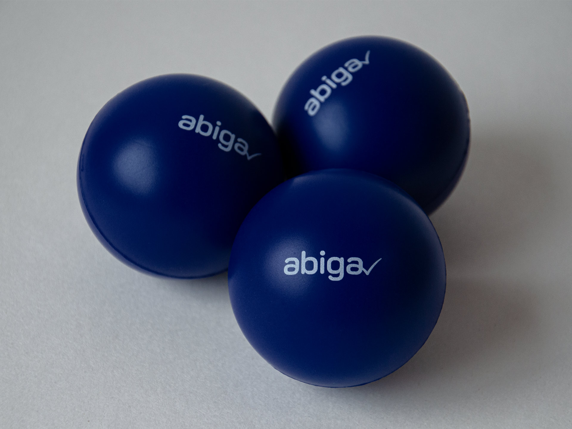
Just like the name, we designed the logo with a focus on simplicity. The modern-looking word mark “abiga” includes no unnecessary ornaments while the small tick mark at the end gives it an individual touch that makes it clearly recognisable. In its entirety, the logo subtly conveys abiga’s promise of making it easy to “tick off” the unpopular subject of building drainage.

Claim
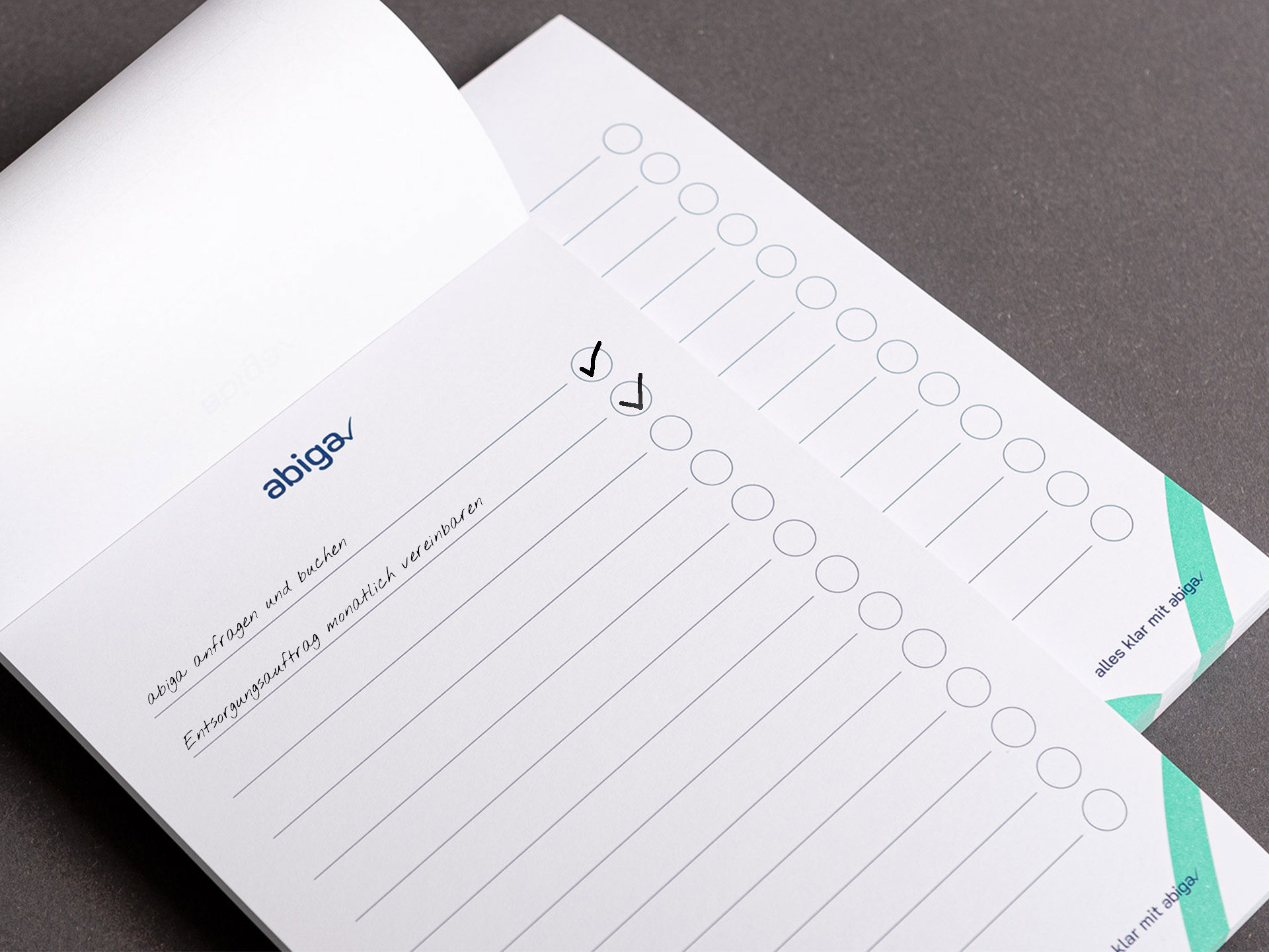
The claim Alles klar mit abiga (“No worries with abiga”) summarises the central brand message in the form of a memorable rhyme. It is usually employed at the end of documents as the final piece rounding off the brand identity.
Sales presentation
Together we developed strategic and conceptual solutions for communicating the innovative lines of business in sales. The services, which require explanation, were framed in simple but effective terms and are presented to new customers e. g. via an animated Powerpoint presentation.


Illustrations
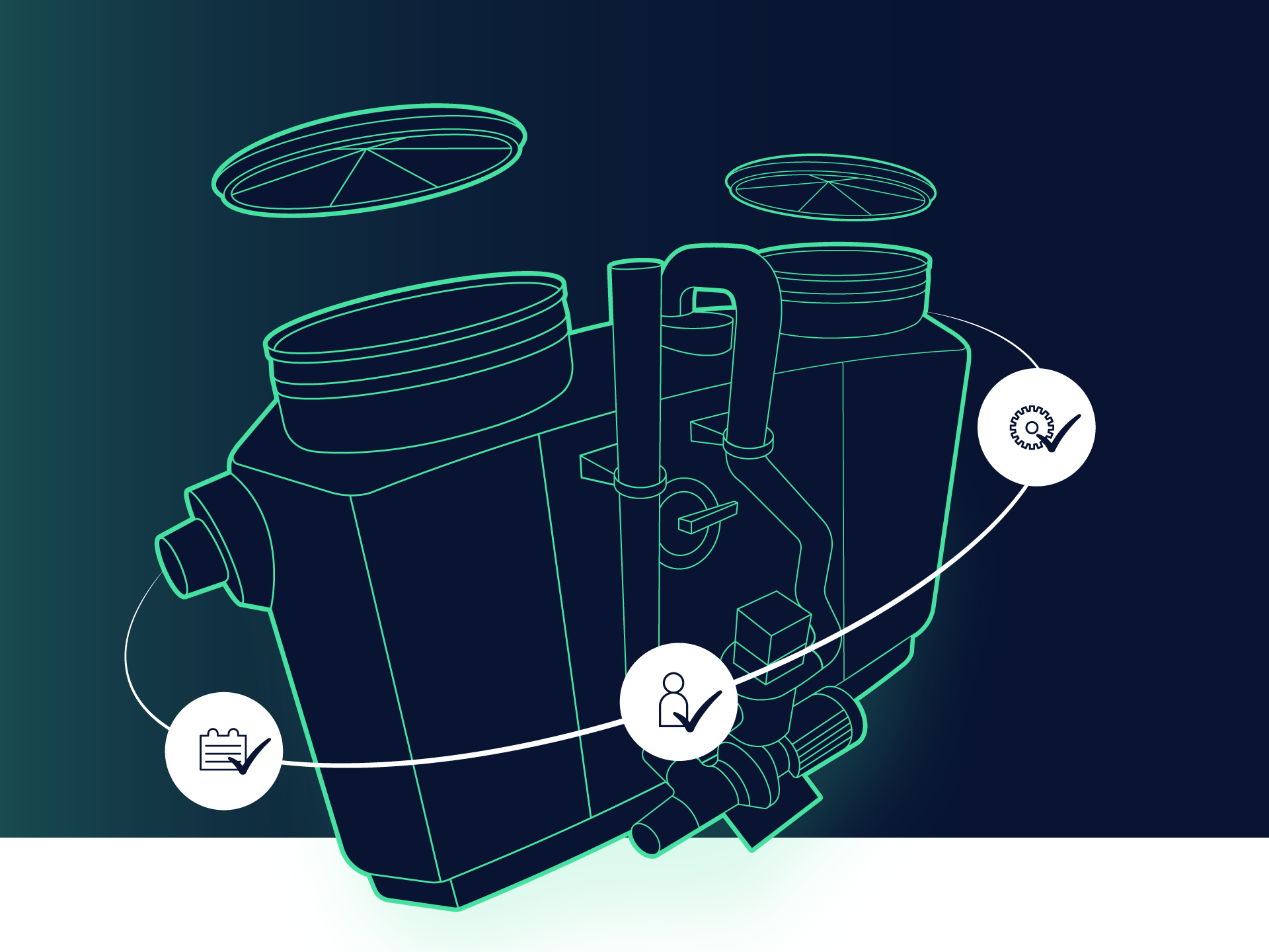
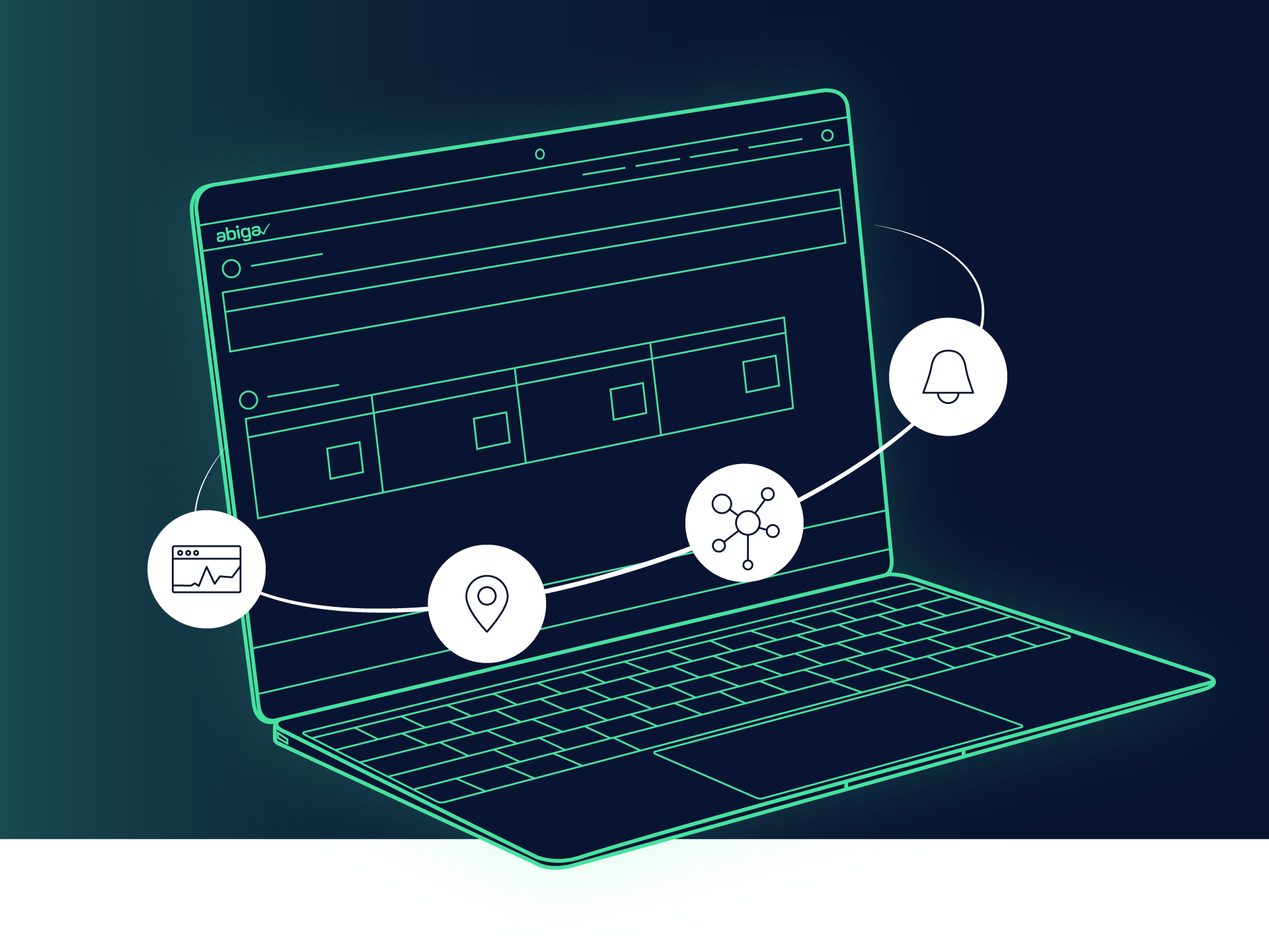
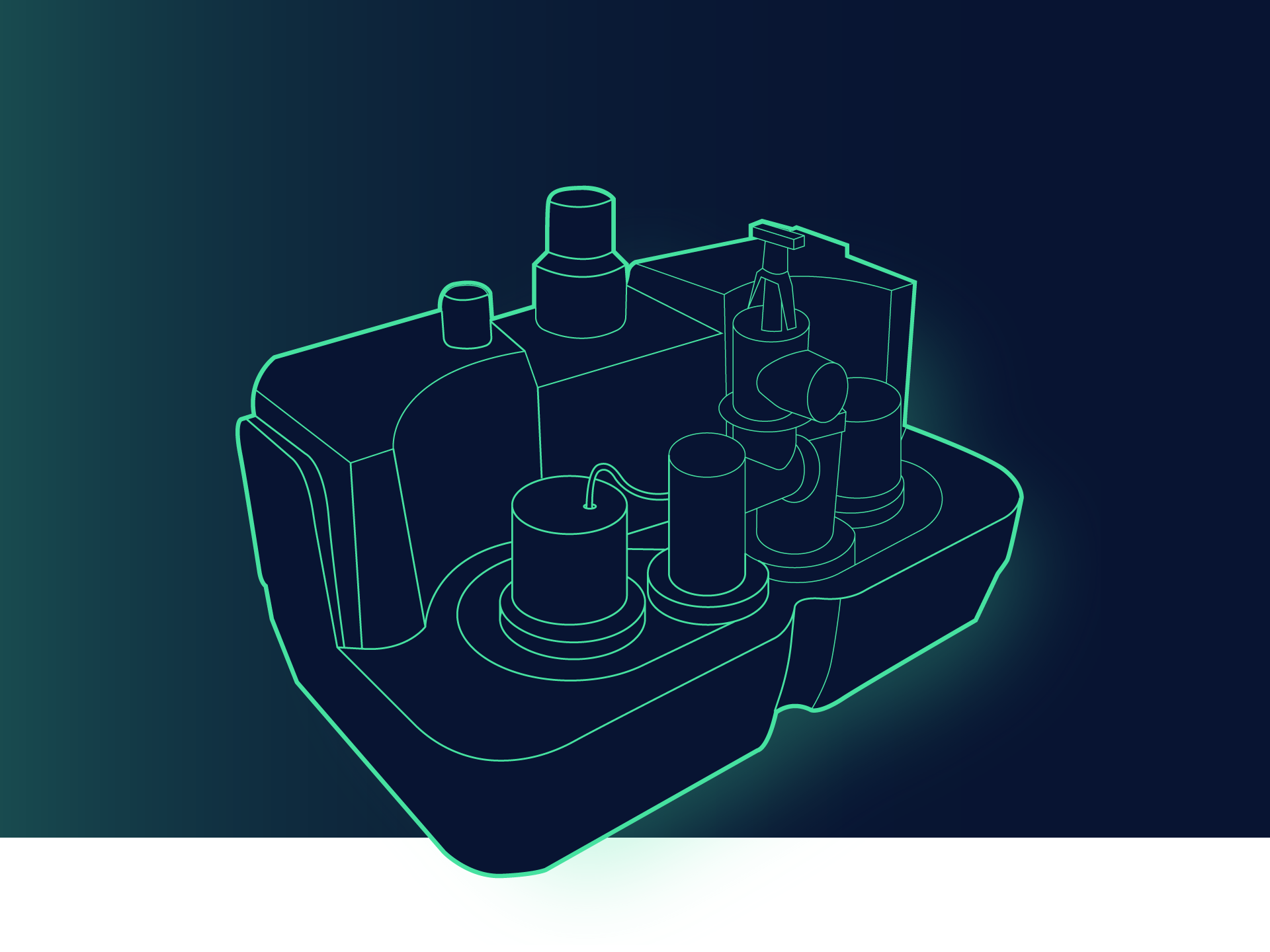
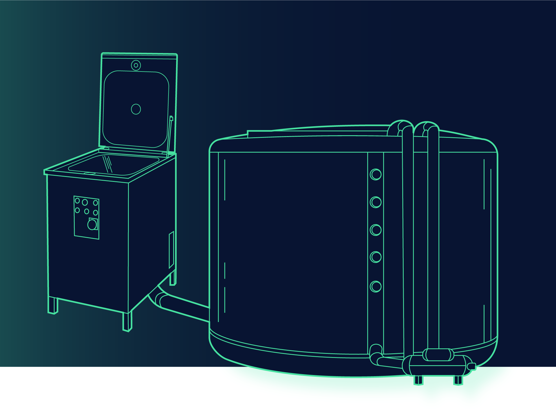
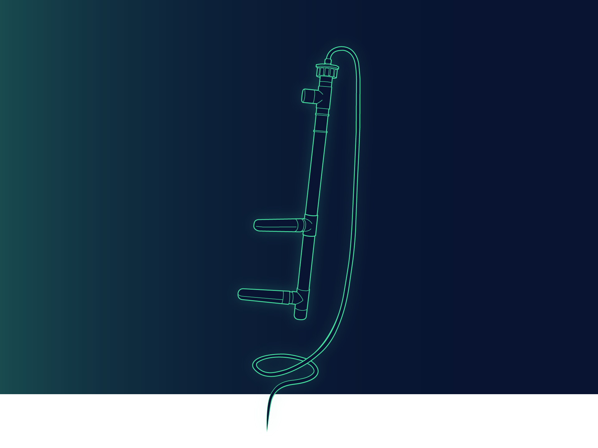
As abiga utilises drainage products from various manufacturers, we illustrated the offering with vendor-independent, abstracted representations of grease separators, pumping stations and the like in a style developed specifically for the brand. The illustrations are evocative of “digital twins” of the machines and therefore also represent their connection to the abigaPortal monitoring platform.