Systematic design.
As one of the largest social science institutes in Europe, Deutsches Jugendinstitut (DJI) provides vital research for German politics on the national, state and city levels. We strengthened the DJI brand with a comprehensive design refresh while ensuring the look and feel can be flexibly adapted based on clear rules.
Task
DJI commissioned us to refine its brand design, building on the strong foundation of its established logo. Over the years, the old brand identity had been extended by a multitude of elements and lost its focus. We should restore it with simple, flexibly applicable brand elements.
Design system
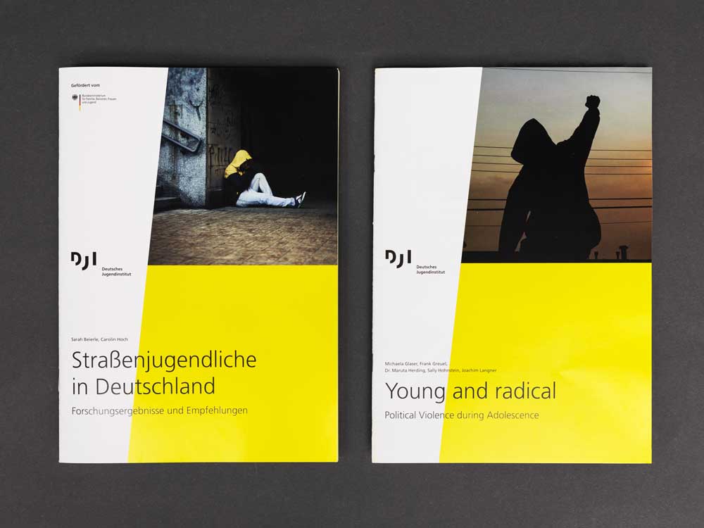
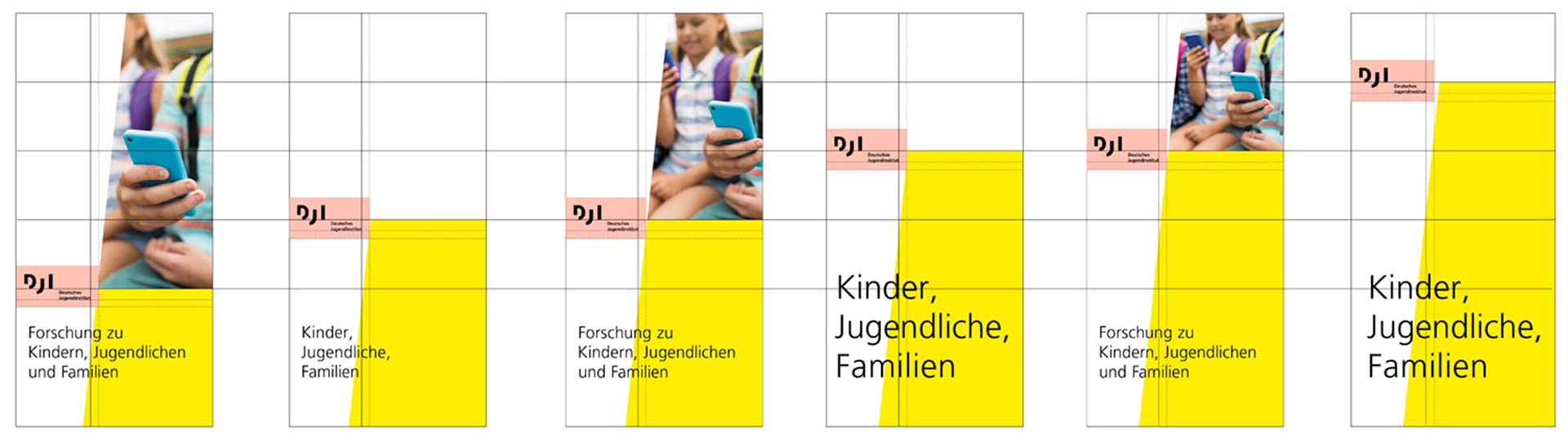
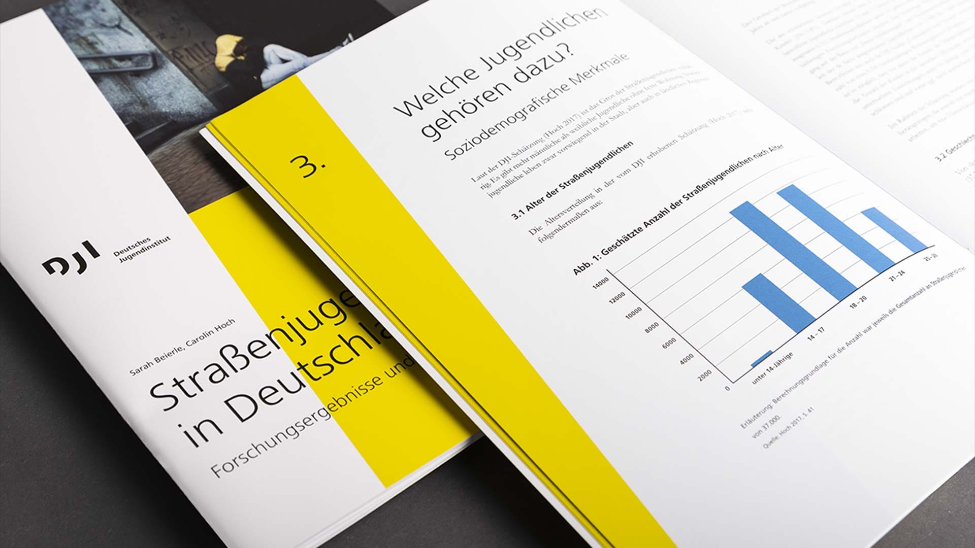
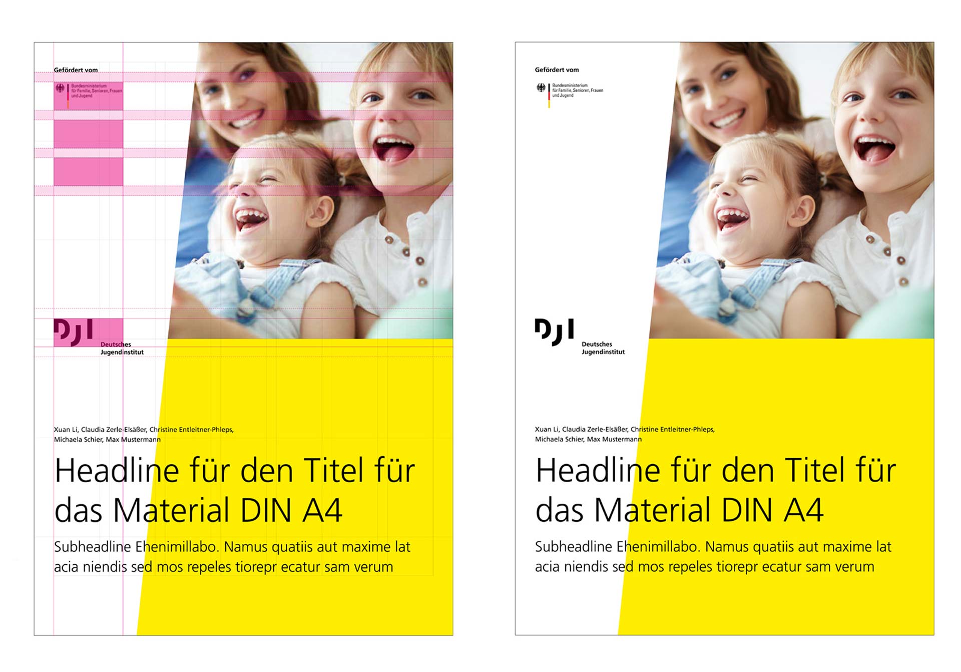
We developed a design system that manages the balancing act between flexible options and a consistent basic effect. It’s based on a grid that makes it possible to easily design publications in all formats and with all amounts of images and text. In combination with DJI’s striking yellow colour and the distinctive diagonal line on all front and title pages, this results in an overall impression that conveys integrity as well as independence and modernity.
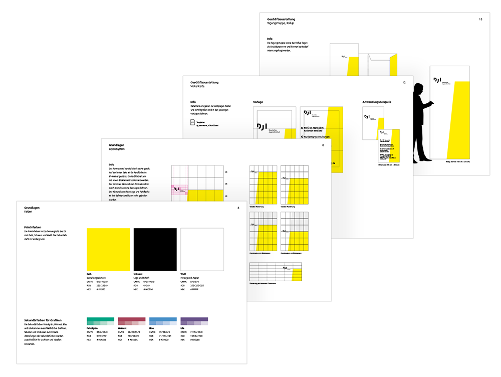
Design manual
The institute’s publications aren’t only created by service providers such as agencies and printers but also DJI’s scientists themselves. Therefore, another important part of our mission was to make the design usable for anyone. Consequently, we created both a comprehensive template package for designers and non-designers and a design manual with hints and tricks to help them apply the new system consistently. Hundreds of scientific articles, posters, project report, brochures and chronologies are created on this basis every year.


