Less colour, more impact.
Diagonal lines and black-and-white design elements with neon accents are brigk’s visual trademarks. They are consistently applied throughout all brigk media to ensure the brand’s high recognition value.
Colours
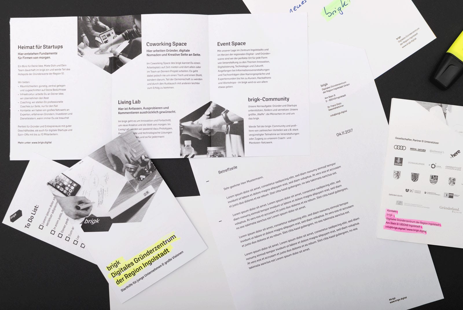
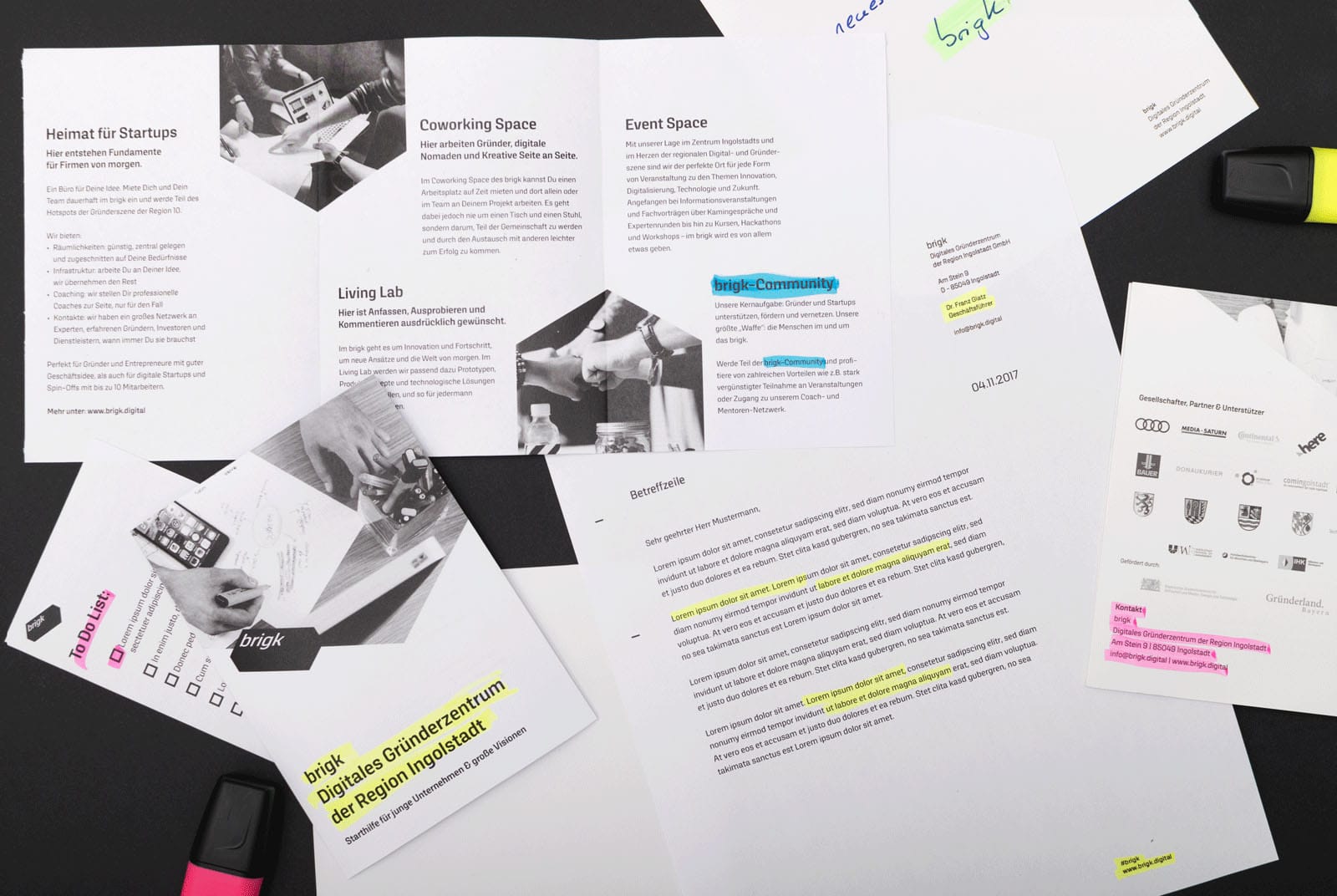
brigk’s largely black-and-white visual brand presence corresponds to the incubator’s neutral, intermediary role and openness as well as the technological coolness that is often associated with the start-up scene. This contrasts strongly with the accent colours neon green, yellow, pink, and blue that set signals throughout the publications just like brigk does in the German economy and scientific community.


Imagery
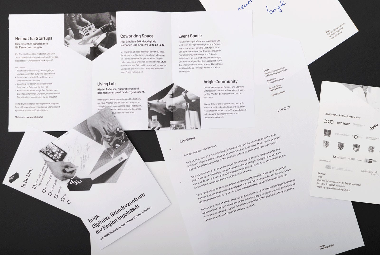
brigk media are illustrated with black-and-white photos. Like the entire brand presence, they’re ornamented with neon-coloured accents – in this case, hexagonal shapes based on the brand logo that bring certain image sections into focus.


Website & icons
The combination of diagonal lines, black-and-white and neon colours as well as a dedicated icon style add up to a modern and minimalistic website design. Despite the unconventional image formats, it can be displayed on all devices without problems.

brigk Brand Manual
In the brigk Brand Manual, all information regarding the brand design’s practical implementation are summarised clearly for the incubator’s employees and creative service providers.


